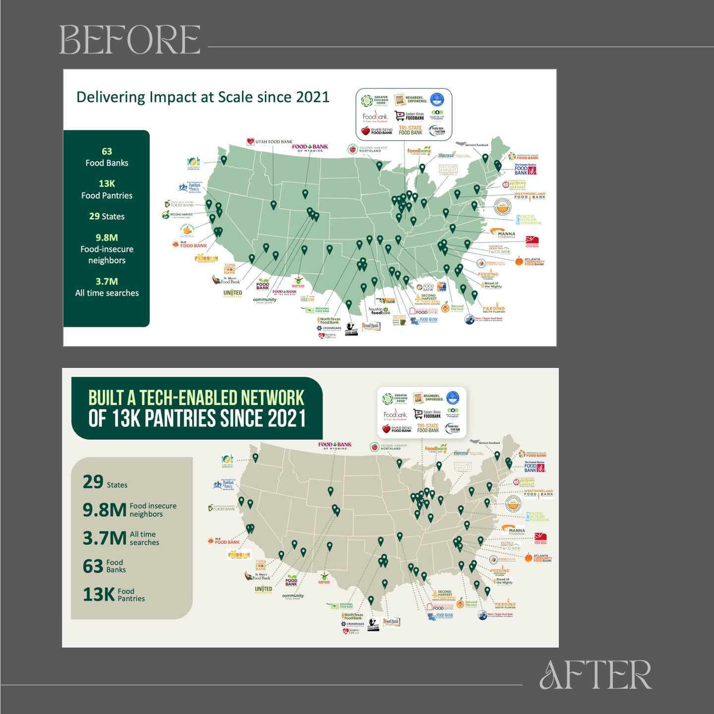
Here is a before and after from a client’s presentation on using technology to help food-insecure people access food pantries and health care providers. You can see the before and after versions, but even the second version is not ideal. Sure, we made some improvements: the headline is more apparent (specific), and the metrics are displayed more prominently in a more “calm” visual hierarchy. And we added some animation so that the map and the locations appear first, then the logos, and then the metrics. In short, we guided the audience's attention better.
However,…when clients cram too much into a slide, design stops. Imagine walking into a home overflowing with objects. No matter how much you reorganize, the clutter dominates. A slide overloaded with information is no different: it undermines the impact of any design improvements.
A good slide should communicate one idea clearly or a grouping of closely related concepts, leaving room for design. Given that this slide caters to too many different ideas, additional visual techniques or elements would be perceived as more decoration and less design. It's like trying to redesign a hoarder’s house :)