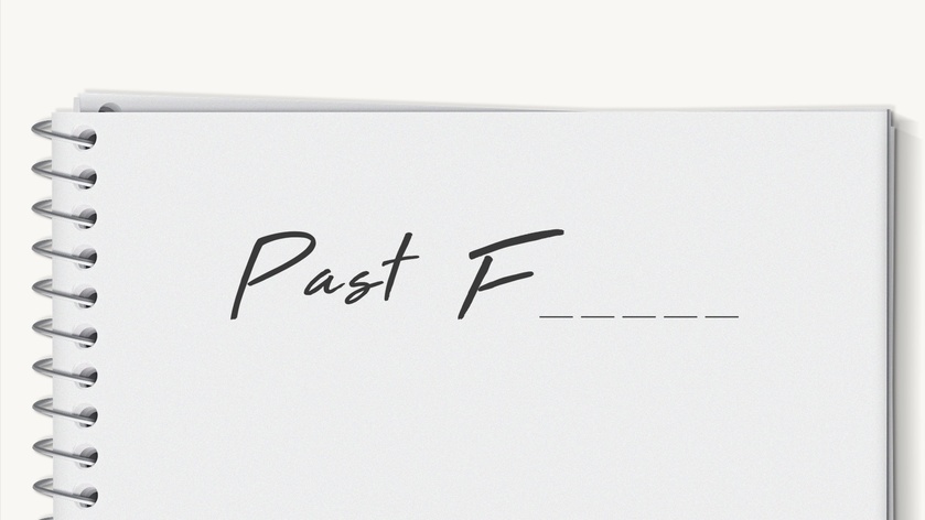
When creating a presentation, it's tempting to think of it as a finished product—a sequence of static images combined with text locked in place. But the most effective presentations are not just static layouts; they're experiences that unfold. Here is an example from a presentation where we wanted to demonstrate the importance of creating an immersive experience in architecture/construction.
Consider this for a moment. In which case would you remember the word “future” better?
Passive content is often forgettable, whereas self-generated content is more likely to be memorable. This is because neural circuits involved in effortful retrieval and prediction get activated, and in the process, there is deeper encoding. Studies show that when we construct a word (even partially), we recruit more brain regions (hippocampus, prefrontal cortex, language networks), compared to just reading it.
So, consider designing some of your content with a bit of mystery. Leave a blank, pose a riddle, or hold back a keyword. Give your audience the gift of finishing your thought. Let them feel clever. They will remember not just the answer but the moment they figured it out, too.
Here is real-time brain data from a participant in one of my neuroscience studies: You can see how we monitor EEG for cognitive activity, ECG for physiological arousal, and eye-tracking for visual attention. Here are some practical reminders of what we learn from participants and these types of studies:
1) You can create surprise (which can impact memory) with sequence. It’s not only what you show, but when you show it. So, analyze the flow of segments in your communication and consider breaking that flow right before important points.
2) Clarity without struggle feels good, but clarity after struggle feels earned. Your audience's brains will appreciate fluency and ease, but... consider offering it after tension and some difficulty. Otherwise, fluency is an illusion: people think they will remember something in the moment, but they forget very quickly (sort of like hearing a good joke that you think you will remember forever, but you don't). Make them work harder to detect ...
In one of my neuroscience studies, I wanted to see how buyers were reacting to a text-based email about the features of a software product vs. a brief demo about that product (also included in an email). What you’re seeing below is the aggregated heatmap from the group of buyers who saw the product demo inside the email. The heat maps enable us to detect where buyers are looking and for how long.
The product advertised was a software application that allows presenters to remove background noise when they hold virtual meetings and create a distraction-free environment (e.g., no dogs barking in the background).
Note from the heat maps how buyers’ attention gravitates toward the speaker’s face, especially the eyes and mouth. This was not surprising because the brain seeks out faces to interpret emotion, intent, and credibility. But then something subtle happens.
As the demo progresses, attention shifts, but not randomly, purposefully. Viewers follow the speaker’s gaze, then track...
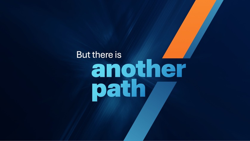
In the flow of a presentation we just built for a tech company, we were outlining some negative trends, and when the situation got dire, we helped the presenter include this slide. There is a lot of strong psychology behind the word “but” because the brain treats it as a signal of contrast. You cannot help but anticipate a shift in perspective. It’s almost like a verbal jolt that interrupts predictive coding....the brain thinks it knows where things are going, but now it must re-evaluate. The small word is so mighty that studies in psycholinguistics show that “but” often overrides what came before. People are more likely to remember what follows it, not what precedes it.
In the case of this slide, we went for striking simplicity: short phrase, large typography, directional lines to make the word “but” feel like a hinge. As a practical guideline, consider well-placed words like but, still, or yet, and pair them with stark visuals to reset attention and make audiences ...
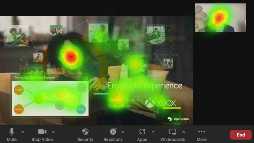
Here is a heat map from a neuroscience study I conducted, monitoring buyers’ reactions to a sales presentation on predictive analytics. In this slide, the virtal presenter was talking about the importance of using the right data models to detect what customers enjoy about a product. When we look at a heat map like this, one thing is undeniable: faces hijack attention. The brain has specialized circuits for processing them, so no matter how much text or data is on a slide, a face will win.
But not all faces serve the same purpose. In this slide, one face (the stock image of a smiling woman) attracted attention without rewarding it. The stock face only offered a generic signal: “people are happy.” That’s not the insight.
Meanwhile, a different face (the presenter’s own) attracted strong attention as well. Here, the attention was useful. In live or virtual settings, audiences oscillate between the slide and the speaker. So, as a presenter, knowing that your face will attract ...
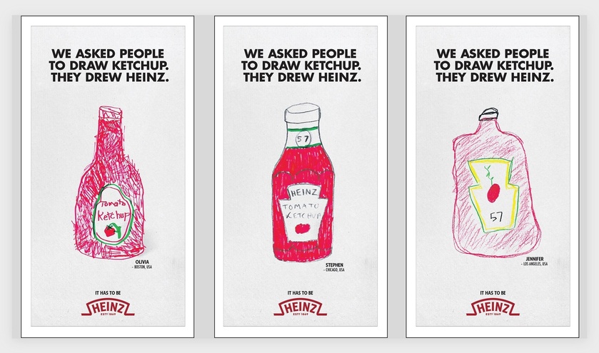
Sometimes, the best communication is not sharing information but rather giving people something to do. Take this Heinz campaign. Instead of announcing, “We’re the ketchup brand you think of,” they gave people a simple task. When we do something, we remember it better. Psychologists call this the enactment effect: memory deepens when it’s tied to an action. There’s also ownership bias at play. When people create something, even a childlike sketch, they feel more invested. Heinz became their ketchup because they drew it.
Philosophers have long argued that we learn through action. Aristotle noted that it is in doing that we come to know. Heinz simply put this into practice, letting an action reveal an essence.
So, consider giving your audience something to do. This is because when they act, they own. And what they own, they rarely forget.
I am noticing that businesses often promise their customers personalized services as a means of differentiation. We offer “tailored solutions,” “customized experiences,” or we “focus on what matters most to you”…. they typically say. Yet, these promises are packaged in standardized presentations filled with generic stock photos. You must have seen slides like the one below many times: Images of generic meetings, people at laptops, or happy people looking at phones. Despite the claim of a “tailored approach,” the content feels like it could belong to any brand.
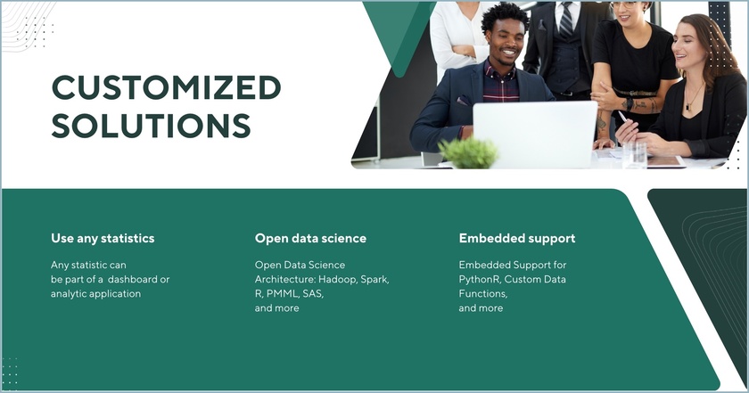
This conflict between the promise of personalization and templatized design creates cognitive friction for the viewer, who unconsciously senses a disconnect between the message of uniqueness and the impersonal images they’re seeing. Cognitive friction occurs when an audience encounters content that feels out of sync with the promised message. The brain, always searching for coherence, struggles to reconcile this gap, making the message less memorable and even eroding trust.
There are several ways to fix this, but here are three. Use images and compositions that help your audience envision:
- The experience they will have while working with you
- The process they will complete to achieve business results and/or
- Outcomes they are seeking
The following slides are from a sales presentation we designed for a platform used in predictive and prescriptive analytics. Each slide exemplifies one of the guidelines above.
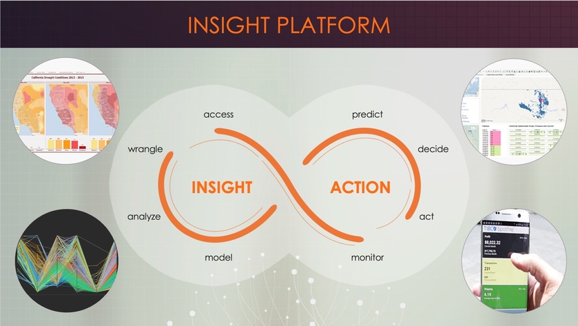
Visualizing experiences
Using this slide, the vendor visualizes a proposed journey and explains to his customers how they can oscillate between action and insight by using various software capabilities. The screenshots are from the real application; they are not stock photos.
Visualizing process
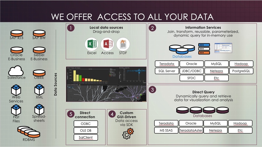
These segments are displayed gradually (note how some are numbered) to explain how the process of working with the vendor and the software will unfold. This step-by-step breakdown gives a concrete sense of how collaboration happens in real life.
Visualizing outcomes
This slide is presented multiple times to remind customers why this vendor’s solution is useful. Displaying expected results reinforces the value that a solution can bring.

Throughout these examples, notice the absence of overly staged smiles and generic stock photos—the kind that make presentations feel interchangeable, standard, and impersonal.
By anchoring your message in authentic experiences, clear processes, and real outcomes, you’re aligning your content with the brain’s natural drive for coherence. This approach reduces cognitive friction and reinforces the trust you’ve promised through personalization. The result? A presentation that feels unique, credible, and memorable—one that embodies the tailored experience you’ve promised.
In one of my neuroscience studies, I decided to compare the brain's response to a business video meant to intrigue buyers with an app versus... well, a video of tea brewing. As you can see below, nothing but tea leaves slowly steeping. I thought, 'This is going to be the ultimate snooze test.' But to my surprise, people weren’t bored! On the contrary, they enjoyed the moment and remembered it later. I suspect one of the reasons is because of a process called reflexive thinking.
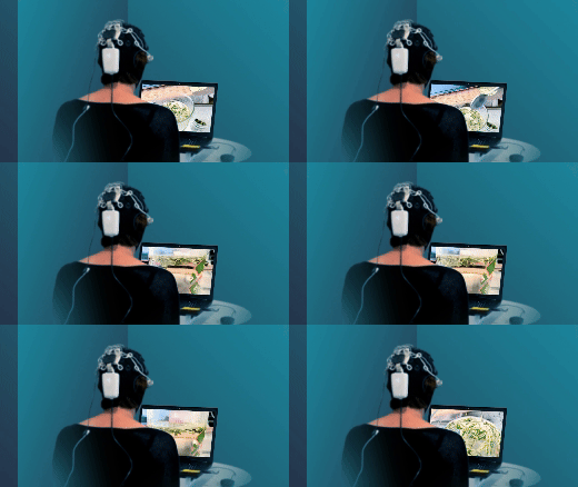
Reflexive thinking is a kind of mental space where, when there isn’t much happening on screen, our brains start filling in the blanks. We reflect on our own thoughts, make connections, or dig into personal insights. This state doesn’t just hold attention—it encourages better memory and even creativity.
Of course, the surprising results might also be due to anticipation. Even with slow visuals, the brain stays alert, waiting for the unexpected. Maybe something surprising will emerge from the cup? This quiet anticipation keeps viewers engaged on a subtle level, almost as if they’re playing a mental game with the content.
The brain thrives on the unseen edges of a moment, where thought meets possibility.
So, how can you use this in your own content, even if you’re not a designer?
- Use gentle transitions: Instead of sharp cuts or rapid slides, try slow fades. They subtly signal the brain to slow down, encouraging a deeper mental pause.
- Create a few minimalist moments: Include a slide with just one word or a blank pause with a simple background. This "mental whitespace" gives viewers time to digest what came before, making it effective even in tech-heavy presentations (as long as it's kept to a minimum).
- Slow down the summary: Consider using a reflective tone to signal a shift from information delivery to introspection. This change in pace cues your audience that it’s time to absorb and reflect on what they’ve learned, reinforcing their memory of the content as they mentally summarize it themselves.
Sometimes, the mind finds depth not in speed but in the silent pull of what might come next.


