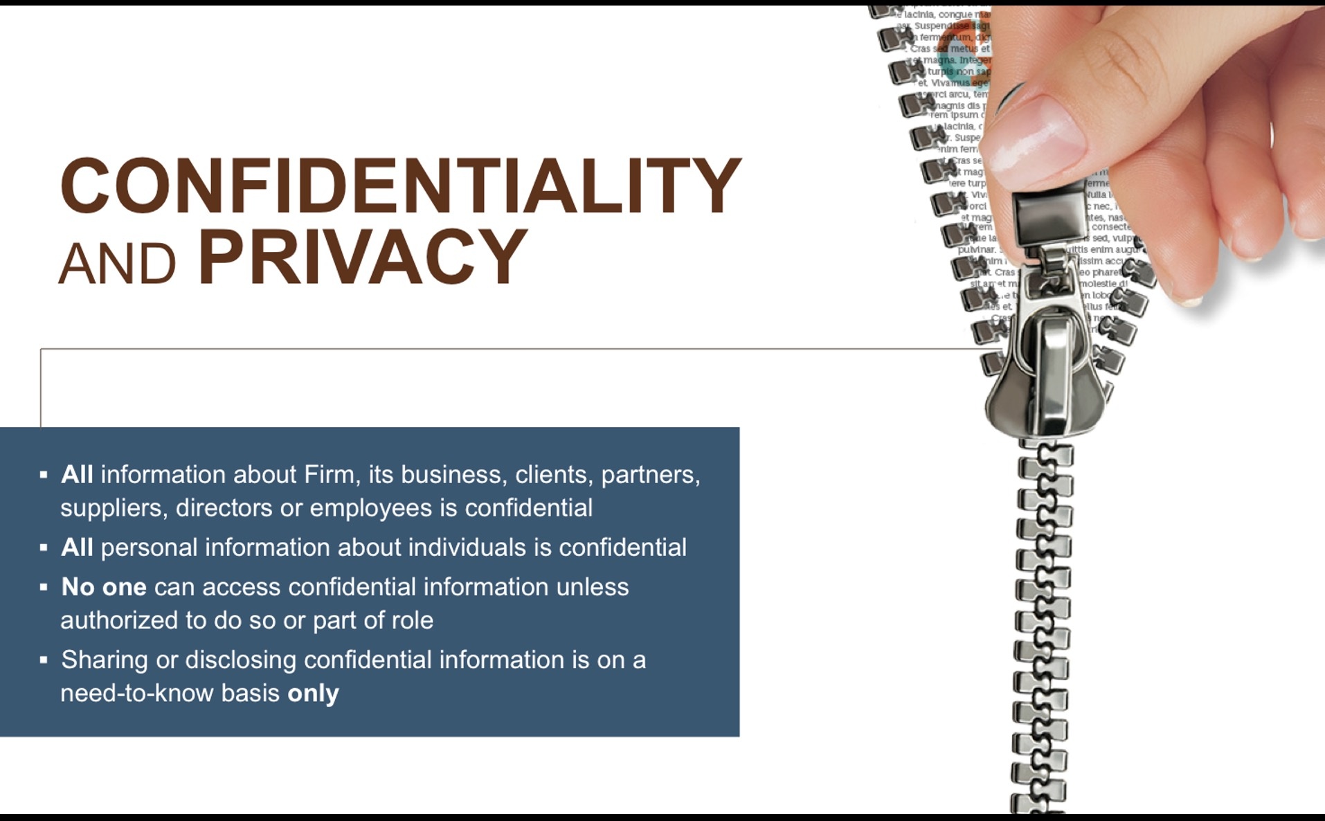
Here is a slide from a presentation we created a while back for a corporate legal team. Their presentation was internal, and they were worried because internal topics like compliance, governance, or code of conduct are boring. But I’ve learned that even the driest internal topics can be rescued with visuals that trigger curiosity and emotion.
A zipper placed in a corporate presentation about confidentiality feels slightly unsettling and since it’s half open, it suggests a boundary being crossed. So, if you ever design internal content, try visuals that feel slightly wrong for the context. The unease keeps people engaged longer than comfort ever could.
The team could have used a padlock too, but a zipper, unlike a padlock, is something we feel a bit more. The stronger tactile association triggers somatosensory networks, which improve memory encoding through embodied cognition. So, if you have to communicate something abstract (ethics, governance, privacy), ground those topics in touchable metaphors like textures, movements, or gestures to make the abstract physical.