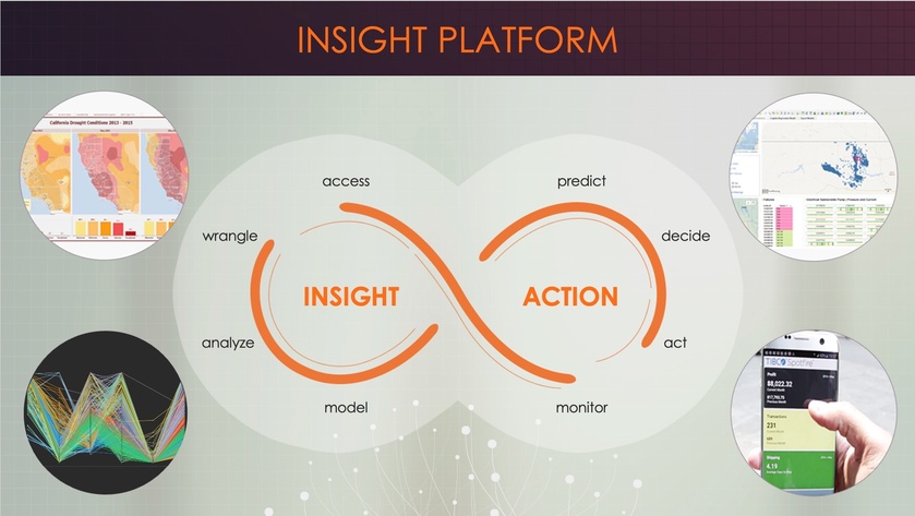
An attention heat map is not always a memory map
This heat map comes from a neuroscience study I conducted, where I was comparing how buyers process the same information in two formats: digital (viewing slides) and physical (holding a brochure). What you’re seeing here is the digital slide. At first glance, it appears to perform well, with bright colors and engaging icons that draw attention (therefore, the red-hot zones). But if you analyze further, you recognize that attention is scattered. There’s no dominant visual hierarchy.
And, despite all the stimulation, not a single participant remembered any detail from this slide. Not even the title. And titles are supposed to draw attention, but in this case, it got none.
So, what does this mean for you, even if you’re not a designer? First, don’t confuse visual activity with mental impact. Just because someone looks doesn’t mean they’ll remember. Second, always ask: what is the one clear point? What element carries your message?
For comparison, the physical brochure led to more focused attention and better recall. Sometimes, the brain just thinks better when it can hold the message in its hands.