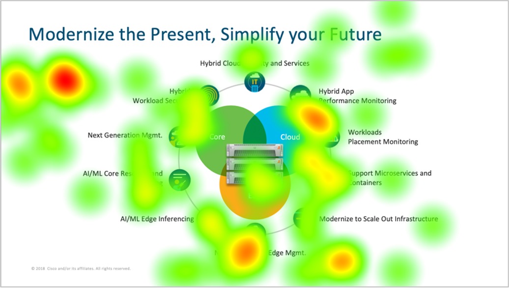
Here is a heat map from a neuroscience study I conducted, where I wanted to see where buyers' attention is directed when they look at slides from a seller's presentation related to the merits of a software application. This slide is meant to communicate a clear message: "Modernize the Present, Simplify your Future." But attention is scattered. You see that more fixations are at the top-left corner, but that is likely impacted by reflexive left-to-right reading habits. The center image, with the server stack and Venn diagram, is visually dense and familiar but not necessarily meaningful. There are also fixations around the points around the platform that the seller was introducing, but this suggests that buyers are scanning, possibly hunting for relevance.
The slide offers plenty to look at (icons, labels, diagrams), but there is no dominant message that gets anchored. Viewers' eyes bounce, searching rather than landing and staying. In other words, this slide tries to say everything all at once.
So, a practical guideline to consider: design for settled attention, not scanning. Ideally, a composition has a clear focal point. To do this, consider sequencing: show a simplified Venn diagram first, then gradually introduce surrounding benefits. This is important because without a clear focal point, the brain skims instead of processes.