When creating a presentation, it's tempting to think of it as a finished product—a sequence of static images combined with text locked in place. But the most effective presentations are not just static layouts; they're experiences that unfold. Here is an example from a presentation where we wanted to demonstrate the importance of creating an immersive experience in architecture/construction.
Here is a slide we created for someone’s presentation, promising their customers that using a certain platform eliminates risk from their operations.
The bungalows look siloed but are, in fact, connected (visually and structurally) by the same boardwalk. This makes the metaphor work but also invites refinement. The client accepted the image, but we wanted to make sure that it would not be perceived as too idyllic, as it may reduce urgency.
Also, when metaphors are too subtle, people may miss the point entirely. There’s subtle dissonance here: the viewer’s first instinct is to associate the image with relaxation, not risk. That tension can be powerful, but only if resolved quickly in narration or adjacent slides.
We did both. We instructed the speaker to have an urgent tone about the matter and the slide was followed by extreme examples of what happens when risk is not managed well. This was a good lesson for us because, when the image is this beautiful, we cannot assume the viewer will feel the risk. So, choose metaphors that keep just enough friction to pull attention forward, and sometimes beautiful images need to be contrasted with a solemn voiceover.

Here is real-time brain data from a participant in one of my neuroscience studies: You can see how we monitor EEG for cognitive activity, ECG for physiological arousal, and eye-tracking for visual attention. Here are some practical reminders of what we learn from participants and these types of studies:
1) You can create surprise (which can impact memory) with sequence. It’s not only what you show, but when you show it. So, analyze the flow of segments in your communication and consider breaking that flow right before important points.
2) Clarity without struggle feels good, but clarity after struggle feels earned. Your audience's brains will appreciate fluency and ease, but... consider offering it after tension and some difficulty. Otherwise, fluency is an illusion: people think they will remember something in the moment, but they forget very quickly (sort of like hearing a good joke that you think you will remember forever, but you don't). Make them work harder to detect ...
In one of my neuroscience studies, I wanted to see how buyers were reacting to a text-based email about the features of a software product vs. a brief demo about that product (also included in an email). What you’re seeing below is the aggregated heatmap from the group of buyers who saw the product demo inside the email. The heat maps enable us to detect where buyers are looking and for how long.
The product advertised was a software application that allows presenters to remove background noise when they hold virtual meetings and create a distraction-free environment (e.g., no dogs barking in the background).
Note from the heat maps how buyers’ attention gravitates toward the speaker’s face, especially the eyes and mouth. This was not surprising because the brain seeks out faces to interpret emotion, intent, and credibility. But then something subtle happens.
As the demo progresses, attention shifts, but not randomly, purposefully. Viewers follow the speaker’s gaze, then track...
Here is a before-and-after version from a presentation in the healthcare space. The audience for the slides includes medical doctors and their staff. The intention of the presentation was to persuade the staff to adopt a new medical procedure. In one of the slides, the presenter reminds the audience that once they accept this new procedure, the practice will receive the support it needs to avoid a steep learning curve and ensure wide adoption. The information is the same in both slides (click to see the other version), but the second version is missing the human face.
We fixed the design because the brain finds it difficult to attend equally to faces, text, and icons at once. A few quick lessons emerge, even if you do not have graphic design skills. It’s beneficial to keep one dominant focal element per slide. If the slide is about action or workflow, use hands or gestures rather than faces. The brain reads this as “someone doing the work.” And in general, be cautious about ...
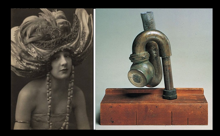
In 1917, artist Marcel Duchamp shocked the art world when he placed a urinal in an exhibition and called it Fountain. He didn’t sculpt it or paint it, he found it, placed it upside down and signed it with an anonymous name. With that gesture, he changed how people could view art, meaning that we can look at art not as an object but rather as an idea and the artist behind it.
What is not as popular is that another artist, Elsa von Freytag-Loringhoven, had done something similar before him. She stuck a cast-iron pipe upside down on a wooden box. It was a pipe you’d normally find behind a toilet, designed to prevent overflow. She titled it God, which is understandable, because imagine what would happen to your life if all plumbing stopped working.
The lesser-known story points to a practical lesson for all of us: every act of seeing can be impacted by someone else. Science shows that some of our memories are molded by what others highlight, repeat, and reframe for us. So, it helps ...

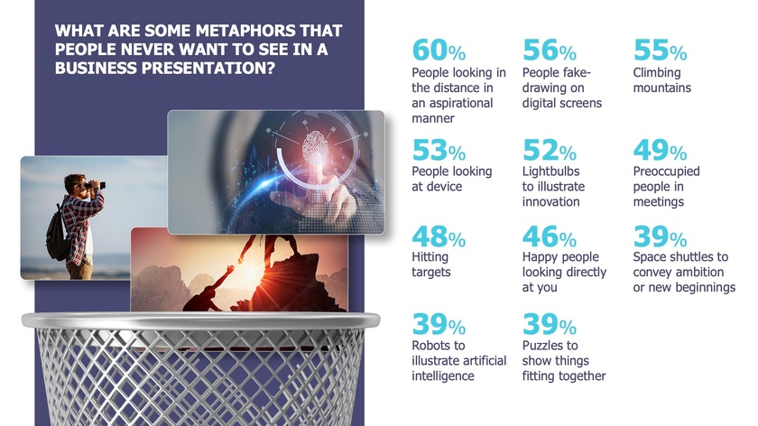
I am sharing an array of results from a neuroscience study I conducted on the impact of cliché vs. fresh metaphors on the business brain (meaning what happens when a persuasive presentation includes too many cliché images and the buyer's brain recognizes them as such). Prior to the neuroscience study, I asked 232 business professionals what type of metaphors they would prefer not to see in a business presentation. These are the stats. You can use the slide as a guide for what to avoid when creating your own content or when coaching or evaluating others' content.

I am noticing that businesses often promise their customers personalized services as a means of differentiation. We offer “tailored solutions,” “customized experiences,” or we “focus on what matters most to you”…. they typically say. Yet, these promises are packaged in standardized presentations filled with generic stock photos. You must have seen slides like the one below many times: Images of generic meetings, people at laptops, or happy people looking at phones. Despite the claim of a “tailored approach,” the content feels like it could belong to any brand.

This conflict between the promise of personalization and templatized design creates cognitive friction for the viewer, who unconsciously senses a disconnect between the message of uniqueness and the impersonal images they’re seeing. Cognitive friction occurs when an audience encounters content that feels out of sync with the promised message. The brain, always searching for coherence, struggles to reconcile this gap, making the message less memorable and even eroding trust.
There are several ways to fix this, but here are three. Use images and compositions that help your audience envision:
- The experience they will have while working with you
- The process they will complete to achieve business results and/or
- Outcomes they are seeking
The following slides are from a sales presentation we designed for a platform used in predictive and prescriptive analytics. Each slide exemplifies one of the guidelines above.
Visualizing experiences
Using this slide, the vendor visualizes a proposed journey and explains to his customers how they can oscillate between action and insight by using various software capabilities. The screenshots are from the real application; they are not stock photos.

Visualizing process
These segments are displayed gradually (note how some are numbered) to explain how the process of working with the vendor and the software will unfold. This step-by-step breakdown gives a concrete sense of how collaboration happens in real life.

Visualizing outcomes
This slide is presented multiple times to remind customers why this vendor’s solution is useful. Displaying expected results reinforces the value that a solution can bring.

Throughout these examples, notice the absence of overly staged smiles and generic stock photos—the kind that make presentations feel interchangeable, standard, and impersonal.
By anchoring your message in authentic experiences, clear processes, and real outcomes, you’re aligning your content with the brain’s natural drive for coherence. This approach reduces cognitive friction and reinforces the trust you’ve promised through personalization. The result? A presentation that feels unique, credible, and memorable—one that embodies the tailored experience you’ve promised.
In one of my neuroscience studies, I decided to compare the brain's response to a business video meant to intrigue buyers with an app versus... well, a video of tea brewing. As you can see below, nothing but tea leaves slowly steeping. I thought, 'This is going to be the ultimate snooze test.' But to my surprise, people weren’t bored! On the contrary, they enjoyed the moment and remembered it later. I suspect one of the reasons is because of a process called reflexive thinking.

Reflexive thinking is a kind of mental space where, when there isn’t much happening on screen, our brains start filling in the blanks. We reflect on our own thoughts, make connections, or dig into personal insights. This state doesn’t just hold attention—it encourages better memory and even creativity.
Of course, the surprising results might also be due to anticipation. Even with slow visuals, the brain stays alert, waiting for the unexpected. Maybe something surprising will emerge from the cup? This quiet anticipation keeps viewers engaged on a subtle level, almost as if they’re playing a mental game with the content.
The brain thrives on the unseen edges of a moment, where thought meets possibility.
So, how can you use this in your own content, even if you’re not a designer?
- Use gentle transitions: Instead of sharp cuts or rapid slides, try slow fades. They subtly signal the brain to slow down, encouraging a deeper mental pause.
- Create a few minimalist moments: Include a slide with just one word or a blank pause with a simple background. This "mental whitespace" gives viewers time to digest what came before, making it effective even in tech-heavy presentations (as long as it's kept to a minimum).
- Slow down the summary: Consider using a reflective tone to signal a shift from information delivery to introspection. This change in pace cues your audience that it’s time to absorb and reflect on what they’ve learned, reinforcing their memory of the content as they mentally summarize it themselves.
Sometimes, the mind finds depth not in speed but in the silent pull of what might come next.


