Specificity reveals attitude
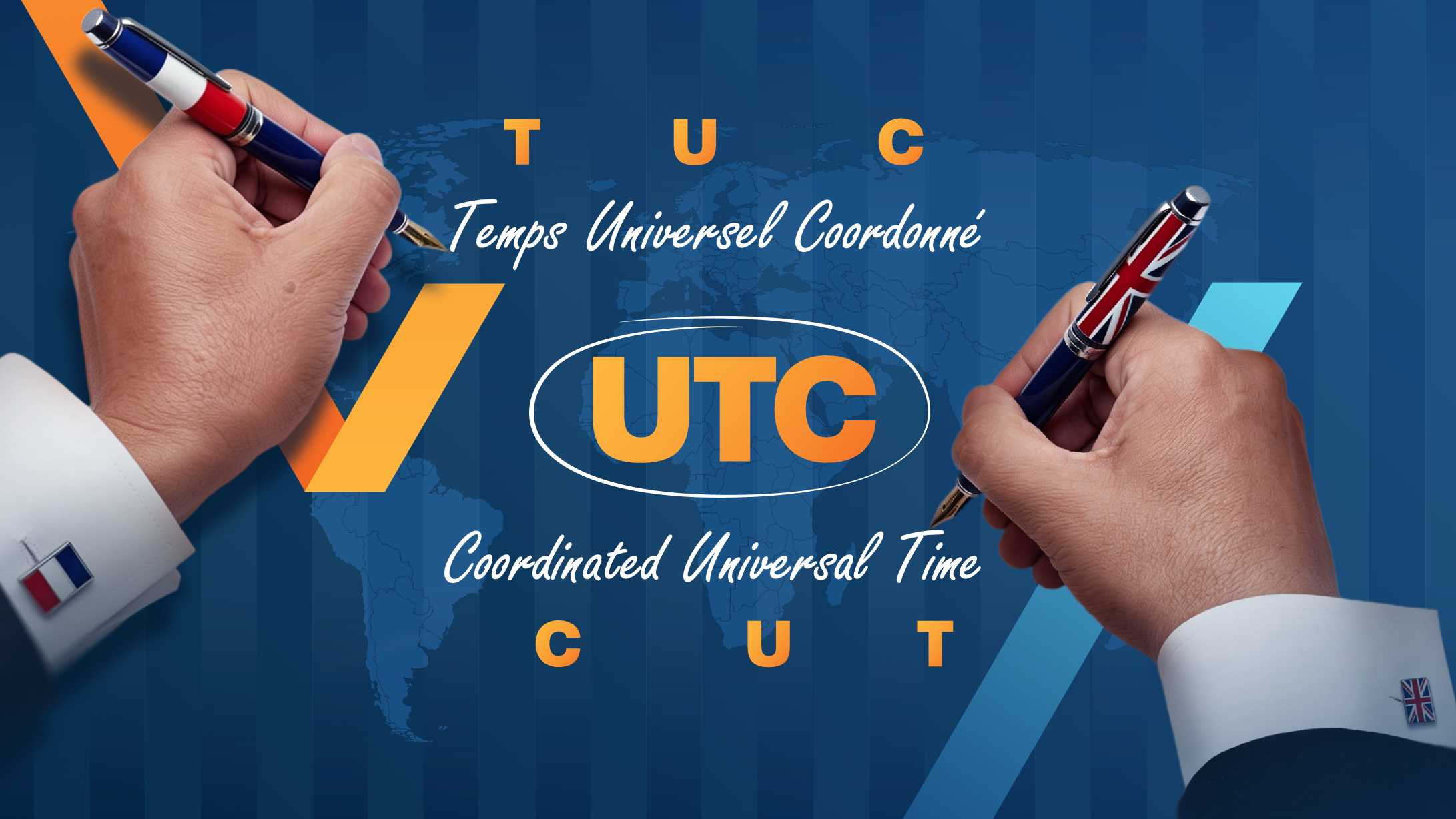
Recently, we were helping a British client develop a presentation about the compromises required in his industry. He used a small historical curiosity to introduce the idea that you sometimes have to compromise with customers and partners: UTC. In English, “Coordinated Universal Time” would naturally become CUT. In French, “Temps universel coordonné” would become TUC. In 1970, the international group responsible wanted one abbreviation that could be used across languages without favoring either side, so they selected UTC, which belonged to neither. So, version 1 of the slide showed this concept with the two hands below, with subtle national symbols. We could easily have stopped there, but felt that the slide did not have any emotion around the concept. So...
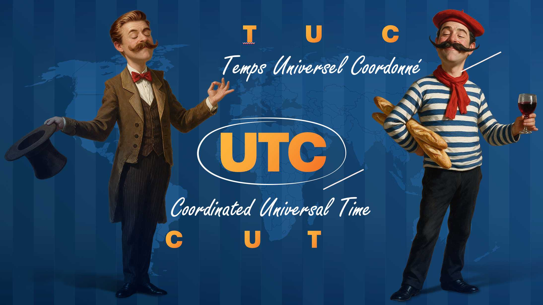
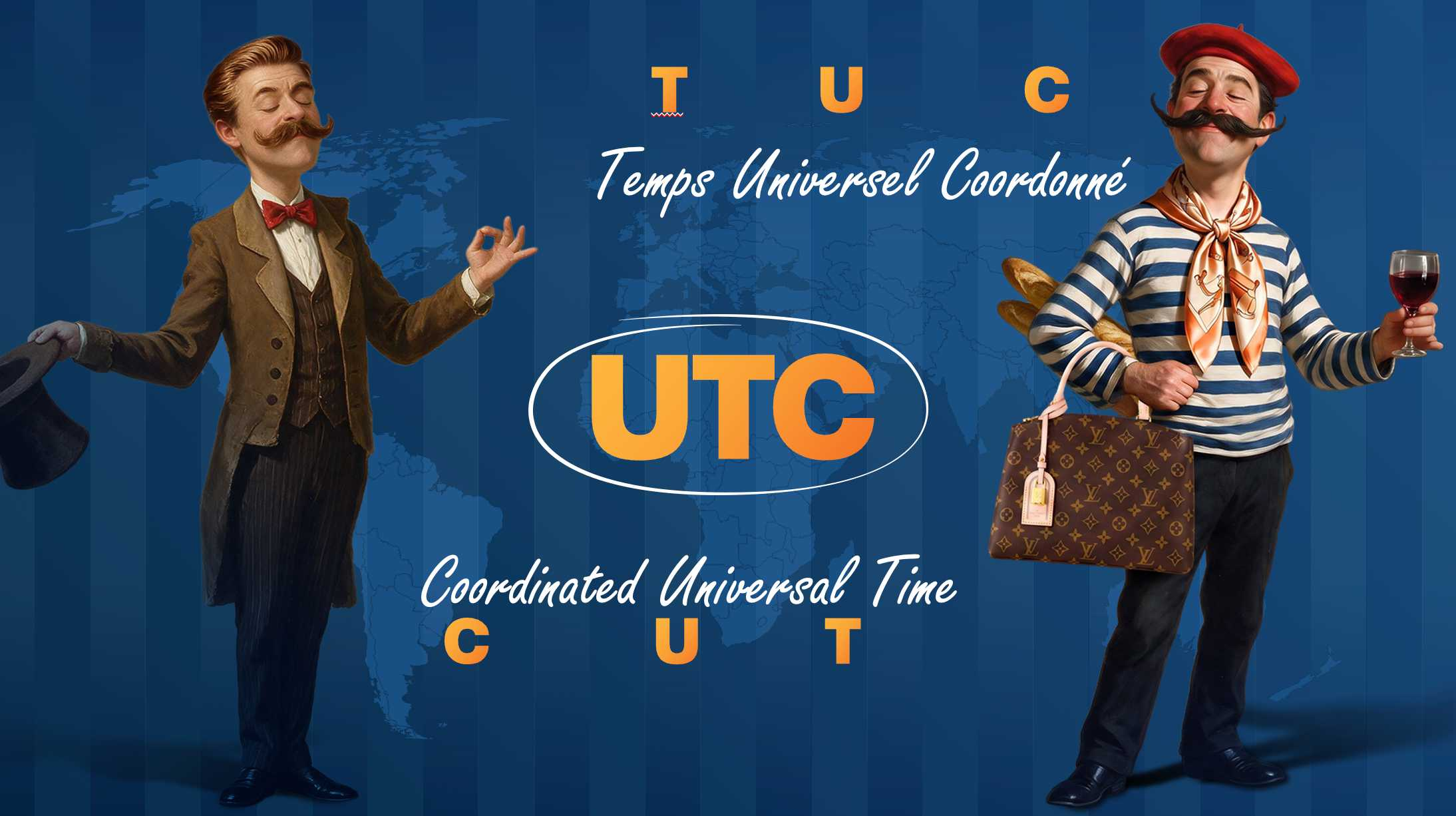
We replaced the hands with two characters (scroll to see version 2). At least now, the audience could recognize the two sides faster, and the slide had a bit more attitude. We could have stopped there too. But we asked the client to push a bit more, and he allowed us. Given that he is British, we kept the Englishman the same, and using an on-click animation, we gave the Frenchman an Hermès scarf and Louis Vuitton bag (scroll to see version 3). Using the animation, he could now say: “Even though the acronym was a draw, the Frenchman still won best dressed.” That final iteration gave the presenter an opening for humor that sounded like him. The slide was now carrying information and also some emotion that stemmed from his personality. As a practical guideline, if you’re creating communication materials for yourself or others, consider this: A presentation has a chance at memory when there is emotion, and emotion can sometimes rise when the audience can detect the presenter in the design, not just the designer.