How to become memorable
Science & Tech • Business • Writing
You will learn guidelines on how to become memorable to your business or personal audiences by using brain science. This is important because people in your life will make decisions in your favor based on what they remember, not on what they forget. To get others to do what you want, they must remember what you want. I am a cognitive neuroscientist and am looking forward to sharing practical results from my neuroscience research that will help you stay on people's minds.
Interested? Want to learn more about the community?

Learn more first
The art and science of useful coincidences

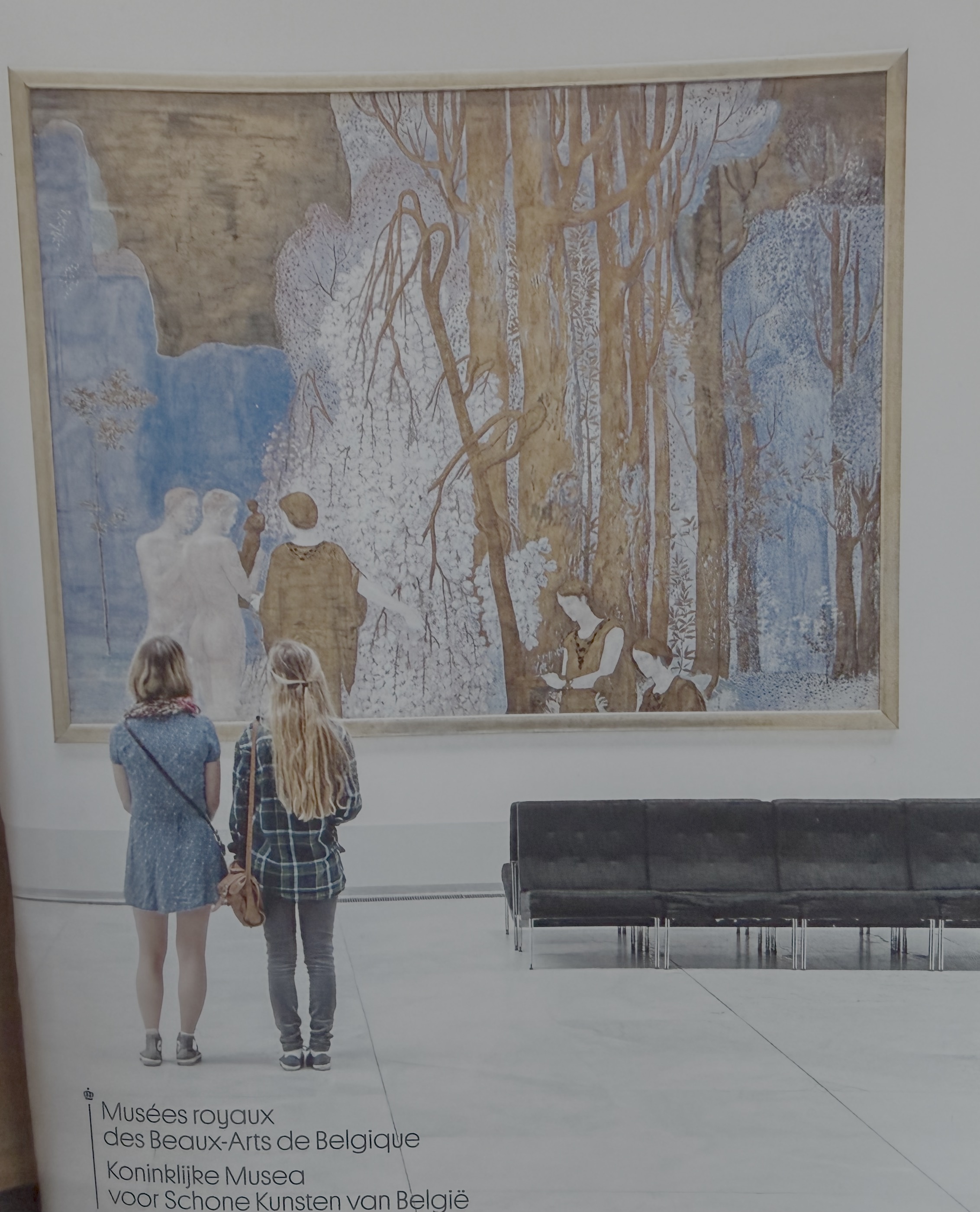
I was visiting a museum and bought a notebook that features two visitors just like me viewing a painting at the entrance. I love this image because one girl’s hair and the other girl’s dress match the painting's color scheme so perfectly, and it invites us into the frame. I initially thought... how long did the photographer have to wait for this perfect moment but then my pragmatism kicked in: surely, this is staged? Since I don't know, and won’t know, the answer, I wondered whether either route could reveal a practical guideline, and it can.

If the picture was indeed not staged, the photographer would have still had to know what to wait for. Otherwise, how would he or she know when to press the shutter? So, practical guideline #1: keep developing skills and train your eye so you can capitalize on serendipitous moments. If the photographer did stage this, can we challenge our assumption that only candid moments are authentic and that staged ones are artificial? Maybe a constructed composition can still reveal something true or express something useful. For example, the painting belongs to Belgian symbolist Constant Montald and is titled The Fountain of Inspiration. The pale figures are having a conversation and drinking from the symbolic source of inspiration, so the visitors outside the painting then are approaching a source of inspiration. And, when you look at them looking at inspiration, perhaps you are next in sequence, as the fountain seems to flow beyond the painted frame and across time. You can see how the photographer created a pretty color match but also extended the painting’s central metaphor into three-dimensional space. So, practical guideline #2: to draw attention, you don't have to wait for serendipity, you can stage information as long as it's insightful.

And in either case, accidental or constructed, the picture is untitled so the photographer invites us to discover something ourselves. This connects with the generation effect: information people help produce is generally remembered better than information they merely receive. So, practical guideline #3: give your audiences something to discover.


post photo preview
Interested? Want to learn more about the community?

Learn more first
What else you may like…
Videos
Posts
Articles
September 16, 2026
AI design vs. human design

I am often asked whether AI design has merit compared to human design. In the neuroscience studies I conduct on the subject, I notice that, on the surface, when I ask participants, "Do you think audiences will appreciate AI design?" and "Are you likely to use AI design?", the answers are yes, as long as "the design is decent." The definition of decent design is up for debate but when I test buyers' and sellers' responses to AI design vs. human design implicitly, without asking them questions related to their attention, cognitive workload, mind wandering, Eureka effects, and motivation to keep going, I notice that while the explicit brain says yes, the implicit reaction (and more genuine one) is no. People mind-wander more as they process AI design; the Eureka effect is not as strong (even when the script is held constant across conditions), and memory is therefore faulty. So, be very cautious, at least for now, about using too much AI in your design for commercial purposes.

00:00:20
The biology of delegation

I am currently conducting a neuroscience study to capture how the brain interacts with AI tools. Participants complete several simulations where they are either the seller or the buyer in a commercial conversation. The study is global and assumes participants speak English while interacting with an AI avatar. This person in Tokyo was super smart and eager to contribute but did not speak English. However, he had a great idea: we trained his AI agent to talk to the AI buyer. I felt like I was witnessing the new era of the future of work, watching an AI seller talk to an AI buyer as the human stays in the loop. A good lesson for all of us: agency does not always look like doing everything yourself. Sometimes it looks like recognizing your limits and finding the right support and a way to accomplish something despite a constraint. In the future, the ability to orchestrate tools may become part of how we are evaluated by others.

00:00:37
Leave room for real

If you have 4 minutes and 7 seconds, you will learn a lot from Karolína Muchová’s speech at Wimbledon today. She played against Linda Nosková, a friend and compatriot, and had to speak within minutes of losing the match, in a second language, without any notes, while visibly overwhelmed. All this makes her speech even more remarkable. Of course, in these contexts, there is a typical structure for the “presentation”: congratulate the opponent, thank the tournament staff, acknowledge the crowd and team, then look ahead. This prepared flow enables you to free up enough working memory so that, in the moment, you can bring in spontaneous honesty and lived moments. This is how she could release tension with a little joke (“Linda, my ex-friend”) and have enough energy to cry, recover, cry again when connecting with people in her corner, and finish strong. Structure can hold you steady enough for something real to come through.

00:04:07
Memory and movement

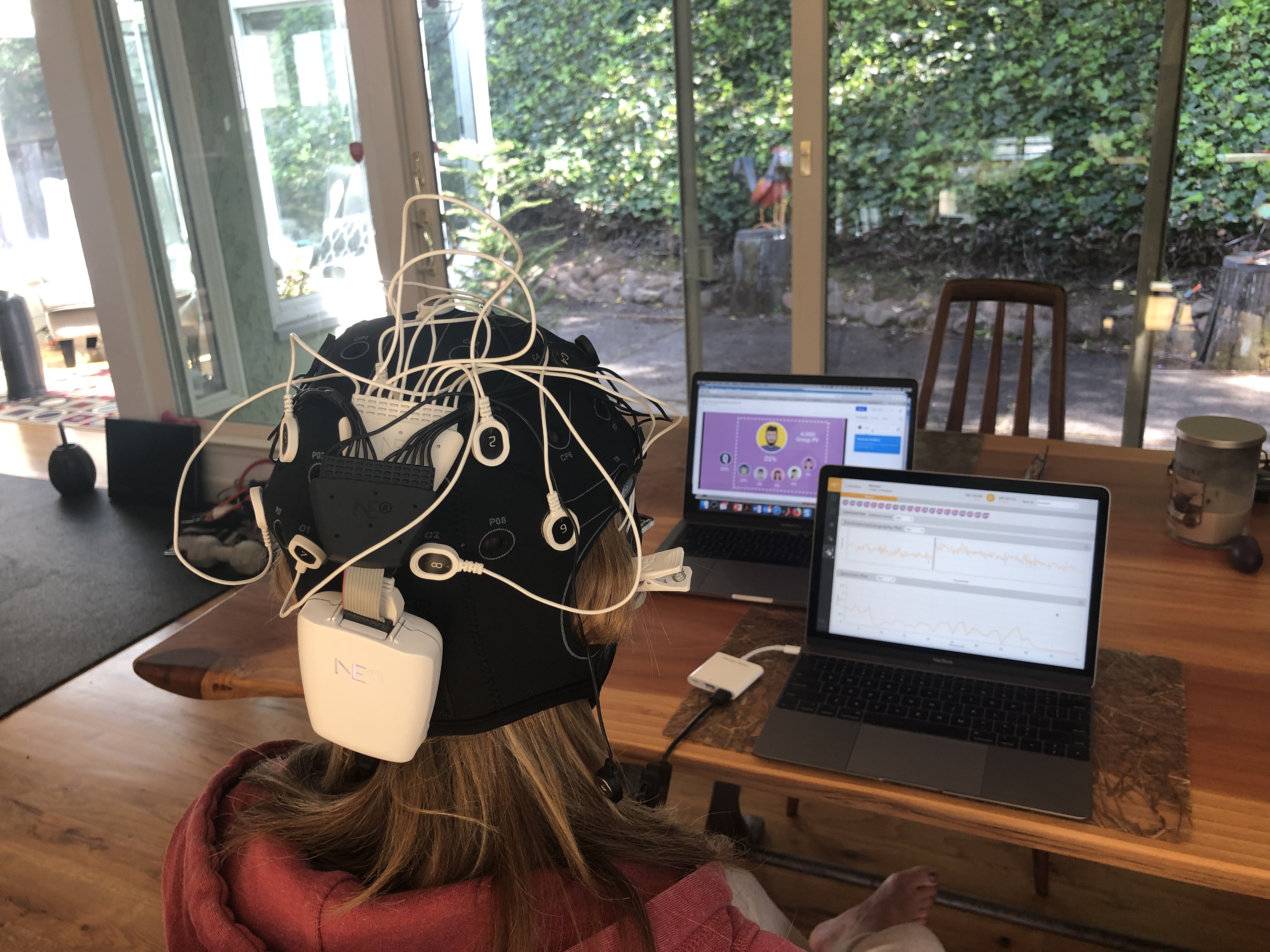
Here is a participant from one of my neuroscience study where I was observing what happens in the brain when people watch corporate videos intended to get their attention and inform them of a new product or process. Many of these videos are created with animated shapes, text, and an upbeat music track. The intuition (or well-known wisdom) is that animation or movement in these types of videos gets attention, and that is correct. But are these videos also memorable? To transform that attention into memory, you don't need movement for movement's sake, you need intention or causality.

You might remember the classic 1944 experiment, where psychologists Fritz Heider and Marianne Simmel showed people a silent animation featuring two triangles and a circle. There were no faces, voices, or words, yet 33 of the 34 participants described the shapes as if they were intentional beings (they pictured them being in pursuit of something, or trying to escape or bully or protect each other...search for...

post photo preview
Cheap form of originality

I was browsing through a magazine and, among hundreds and hundreds of ads, this one caught my attention. It comes from Dedar, an Italian luxury textile house, and features a new fabric called Music: a richly textured pure virgin wool satin with a flowing drape.. Dedar’s Creative Director, Raffaele Fabrizio, deliberately pushed the campaign into the realm of abstract visual storytelling. According to Fabrizio, the goal was to prove that textiles are not passive backdrops but active, architectural elements capable of dictating the emotion and structure of a space. Some of the emotion can come from humor, and, in this case, it’s the surrealist type. Instead of showing fabric draped boringly over a traditional sofa, the ad follows the traditions of fashion design houses like Schiaparelli or Moschino, and prompts us to stop and look.

What I really liked is that the emotion is further emphasized by the contrast between the rigid corporate uniform placed onto a casual, cheap plastic ...

The exception needs a pattern

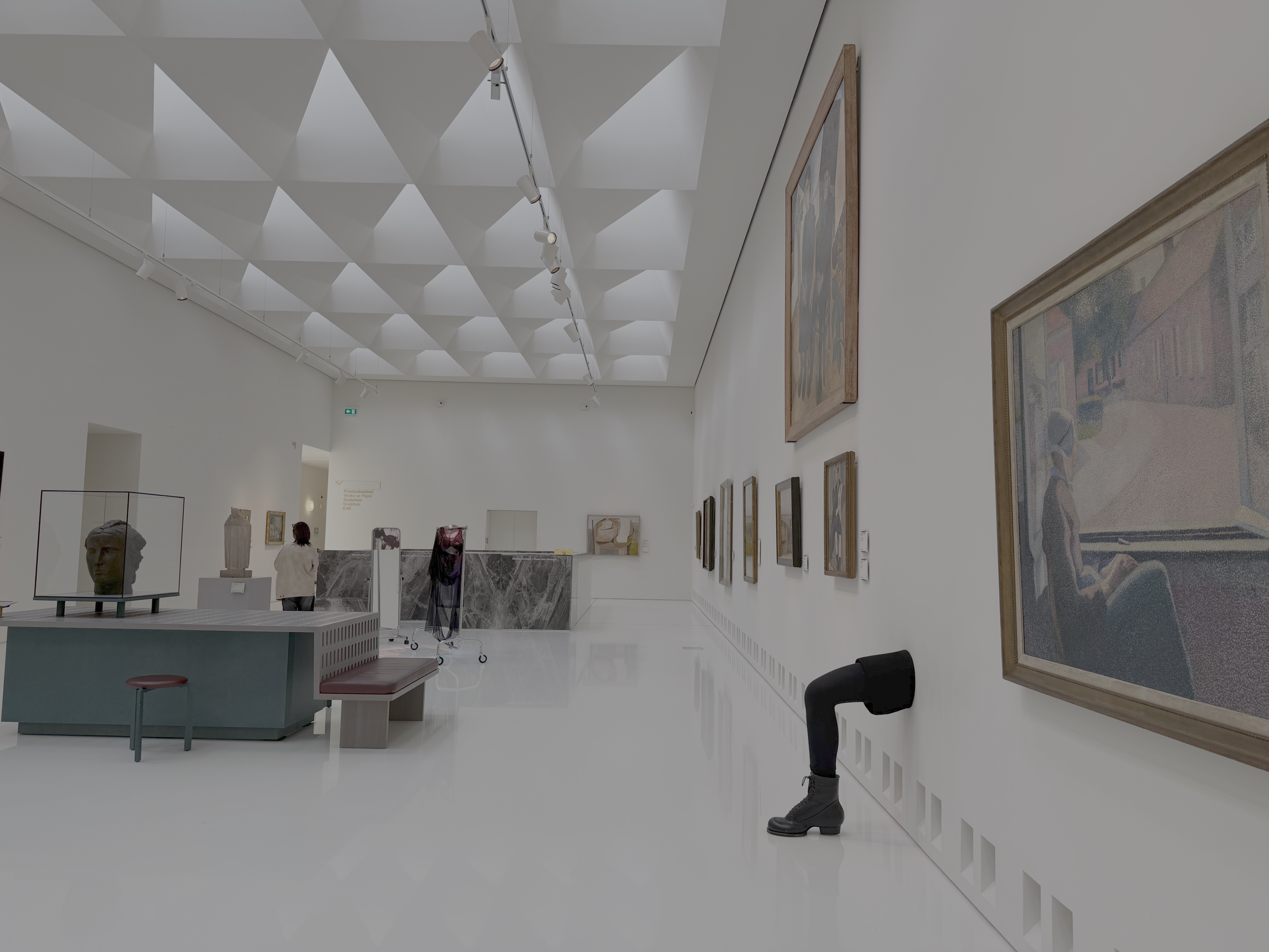
I took this picture in a room in a museum, where everything on the wall followed a pattern: it was framed, flat, rectangular, and contained. I am sure you can tell which object does not fit this pattern. This approach, or contextual distinctiveness, helps the exception stand out and be remembered more. In this case, the museum took this distinctiveness further by giving visitors a goal too: find the surrounding paintings that may have inspired the leg. But for any communicator out there aspiring to be memorable, this is a useful lesson to remember: memorability does not just belong to an object or an idea itself, it is often a consequence of what is around that idea or object. So, for your communication, or as you coach others, consider this: establish a pattern, break one rule near where the 10% message appears (and, if you really want to borrow the other technique from the museum, give your audience a question to resolve).

post photo preview
The storyboard advantage
From ideas to engagement

When creating a presentation, it's tempting to think of it as a finished product—a sequence of static images combined with text locked in place. But the most effective presentations are not just static layouts; they're experiences that unfold. Here is an example from a presentation where we wanted to demonstrate the importance of creating an immersive experience in architecture/construction. 

Only for Supporters
To read the rest of this article and access other paid content, you must be a supporter
Read full Article
From generic to genuine
Reducing cognitive friction in business presentations

I am noticing that businesses often promise their customers personalized services as a means of differentiation. We offer “tailored solutions,” “customized experiences,” or we “focus on what matters most to you”…. they typically say. Yet, these promises are packaged in standardized presentations filled with generic stock photos. You must have seen slides like the one below many times: Images of generic meetings, people at laptops, or happy people looking at phones. Despite the claim of a “tailored approach,” the content feels like it could belong to any brand.

This conflict between the promise of personalization and templatized design creates cognitive friction for the viewer, who unconsciously senses a disconnect between the message of uniqueness and the impersonal images they’re seeing. Cognitive friction occurs when an audience encounters content that feels out of sync with the promised message. The brain, always searching for coherence, struggles to reconcile this gap, making the message less memorable and even eroding trust.

There are several ways to fix this, but here are three. Use images and compositions that help your audience envision:

  1. The experience they will have while working with you
  2. The process they will complete to achieve business results and/or
  3. Outcomes they are seeking

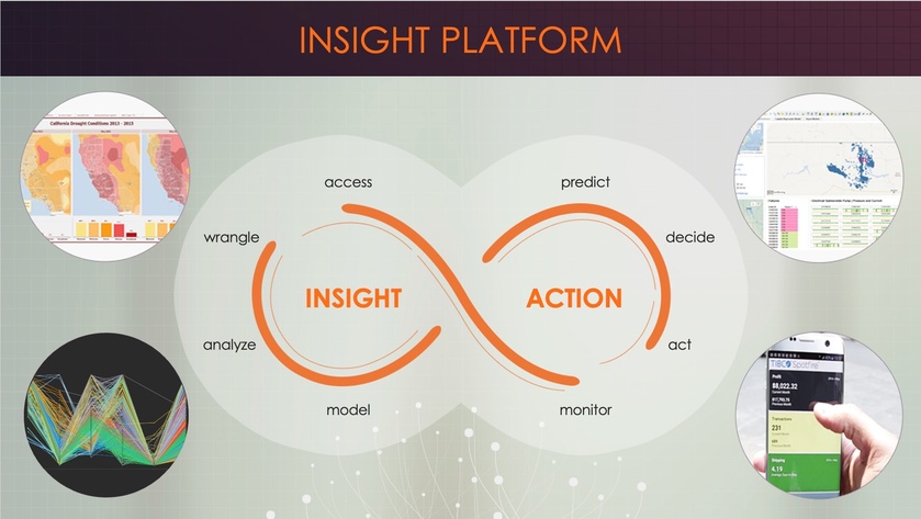
The following slides are from a sales presentation we designed for a platform used in predictive and prescriptive analytics. Each slide exemplifies one of the guidelines above.

Visualizing experiences

Using this slide, the vendor visualizes a proposed journey and explains to his customers how they can oscillate between action and insight by using various software capabilities. The screenshots are from the real application; they are not stock photos.


Visualizing process

These segments are displayed gradually (note how some are numbered) to explain how the process of working with the vendor and the software will unfold. This step-by-step breakdown gives a concrete sense of how collaboration happens in real life.


Visualizing outcomes

This slide is presented multiple times to remind customers why this vendor’s solution is useful. Displaying expected results reinforces the value that a solution can bring.

Throughout these examples, notice the absence of overly staged smiles and generic stock photos—the kind that make presentations feel interchangeable, standard, and impersonal.

By anchoring your message in authentic experiences, clear processes, and real outcomes, you’re aligning your content with the brain’s natural drive for coherence. This approach reduces cognitive friction and reinforces the trust you’ve promised through personalization. The result? A presentation that feels unique, credible, and memorable—one that embodies the tailored experience you’ve promised.

Read full Article
Tea, trust, and thinking
Using slow moments to connect with an audience

In one of my neuroscience studies, I decided to compare the brain's response to a business video meant to intrigue buyers with an app versus... well, a video of tea brewing. As you can see below, nothing but tea leaves slowly steeping. I thought, 'This is going to be the ultimate snooze test.' But to my surprise, people weren’t bored! On the contrary, they enjoyed the moment and remembered it later. I suspect one of the reasons is because of a process called reflexive thinking.

Reflexive thinking is a kind of mental space where, when there isn’t much happening on screen, our brains start filling in the blanks. We reflect on our own thoughts, make connections, or dig into personal insights. This state doesn’t just hold attention—it encourages better memory and even creativity.

Of course, the surprising results might also be due to anticipation. Even with slow visuals, the brain stays alert, waiting for the unexpected. Maybe something surprising will emerge from the cup? This quiet anticipation keeps viewers engaged on a subtle level, almost as if they’re playing a mental game with the content.

The brain thrives on the unseen edges of a moment, where thought meets possibility.

So, how can you use this in your own content, even if you’re not a designer?

  • Use gentle transitions: Instead of sharp cuts or rapid slides, try slow fades. They subtly signal the brain to slow down, encouraging a deeper mental pause.
  • Create a few minimalist moments: Include a slide with just one word or a blank pause with a simple background. This "mental whitespace" gives viewers time to digest what came before, making it effective even in tech-heavy presentations (as long as it's kept to a minimum).
  • Slow down the summary: Consider using a reflective tone to signal a shift from information delivery to introspection. This change in pace cues your audience that it’s time to absorb and reflect on what they’ve learned, reinforcing their memory of the content as they mentally summarize it themselves.

Sometimes, the mind finds depth not in speed but in the silent pull of what might come next.

Read full Article
Available on mobile and TV devices
google store google store app store app store
google store google store app tv store app tv store amazon store amazon store roku store roku store
Powered by Locals