Communicate layers of meaning wtih vibrant design
In a recent presentation, I discussed the pressures on the cognitivist view. This view treats the brain as a computer that internalizes rules and processes abstract information. Contrast this view with the modern way of understanding how the brain works, as seen through the concept of Embodied Cognition. This view emphasizes how our body and environment actively shape our thoughts, emotions, and decisions.
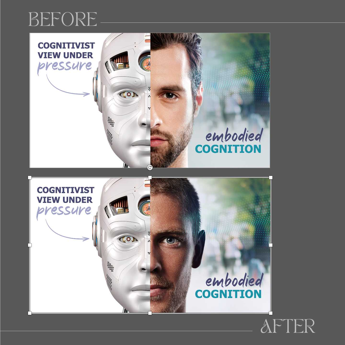
Here is a “before and after” version of a slide from my presentation. The obvious difference between the two versions is related to execution. In Version 1, the misaligned nose between the robot and human sides creates dissonance that distracts from the core message. Version 2 corrects this, making the composition more harmonious. So, this is just a reminder to ensure design quality.
Beyond technical improvements, Version 2 stands out more because it evokes a sense of vitality, better aligning with the theme of "embodied cognition.” The washed-out tones in Version 1 blur the distinctions between the two halves and flatten the emotional impact. Version 2 is tied better to the concept of embodied cognition, which implies layers of physical, emotional, and contextual depth. So, next time you construct a composition, make sure there is enough contrast to match your message. Vibrant elements, in particular, draw attention, emphasize key contrasts, and evoke the energy of the story you’re telling. A washed-out or overly uniform design risks diluting the impact and creating cognitive dissonance.