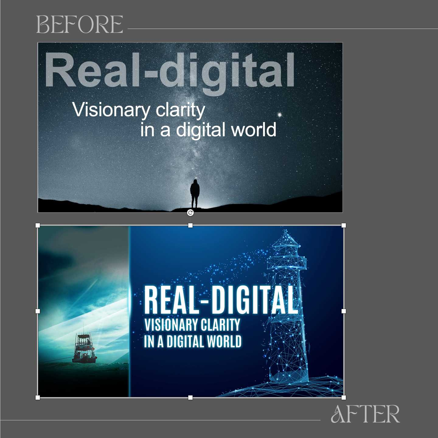
Here is a slide we re-did in someone’s presentation. The slide version needed revision because it relied on a stark approach. The lone silhouette against the sky, while contemplative, lacked dynamic visual elements to capture attention. The composition did not really connect with the "Real-Digital" theme—it felt more abstract than directly relevant.
In the “after” version, we included the lighthouse to symbolize guidance and clarity. The glowing light and digital network overlay were intended to emphasize the "digital" aspect of the theme. The layout also integrates multiple elements (boat, lighthouse, and network) to create a narrative that is easy to interpret.
Here are three guidelines to consider for your next composition or if you’re coaching others on communication design:
1. Give the brain a trail to follow. In the “after” version, there is a higher chance that the eyes will explore the composition to connect the elements together.
2. Make abstract ideas tangible. The lighthouse and digital network are concrete metaphors for “visionary clarity in a digital world.”
3. Invite exploration with a story. The lighthouse triggers a sense of anticipation (light leading the way), which keeps the brain engaged. This effect is missing in the "before" slide.