Too many choices, scattered focus
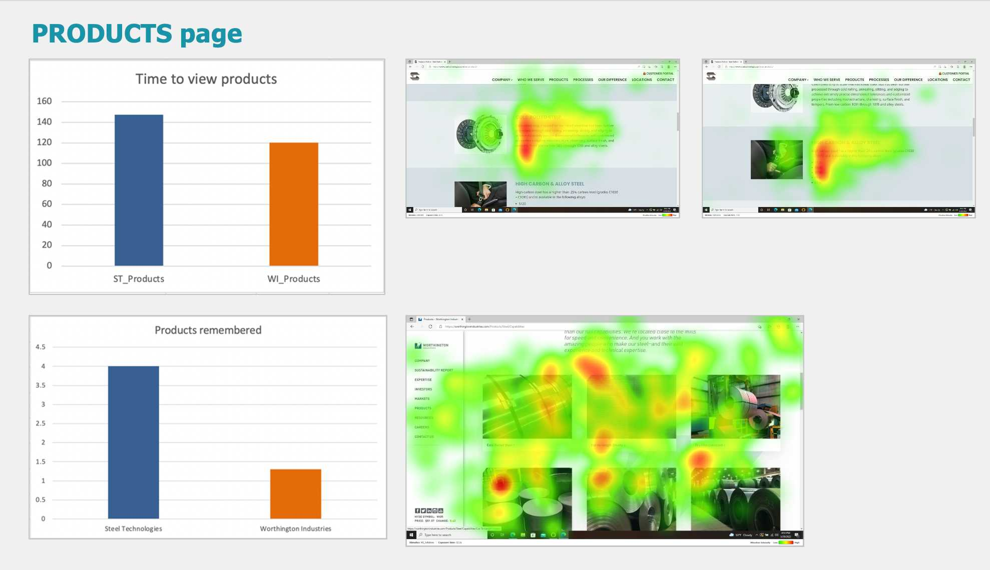
In the attached picture, I am sharing results from a study where I was investigating how potential buyers pay attention to a site in the steel industry. Company A (identified in the bar chart with the orange bar) was curious how their prospective buyers browse through the Products page compared to the competition, Company B (identified in the bar chart with the blue bar). Company B asked viewers to view a single product and its description one at a time (see heat maps at the top), and Company A asked viewers to view many products all at once (see heat map at the bottom). The top bar chart indicates that buyers spend less time viewing the side-by-side products, and they also remember less information about those products 48 hours later. Here are some practical guidelines if you’re in charge of showing your audiences product information:
Display one product at a time or use focused groupings. When viewers see many products simultaneously (as in Company A), their attention becomes scattered, resulting in less focus and less memory.. Keep in mind that memory is important for decision-making.
Present a curated selection of products with concise details, rather than overwhelming users with numerous options at once. This approach leads to better attention, as opposed to superficial scanning, and better memory.
Use intentional visual hierarchy such as large images, clear headings, and progressive scrolling to guide the viewer’s eye smoothly through content. Heat maps highlight areas where viewers linger, but scattered red spots (Company A) suggest an inefficient visual path.