More than just pretty: Composition that impacts meaning
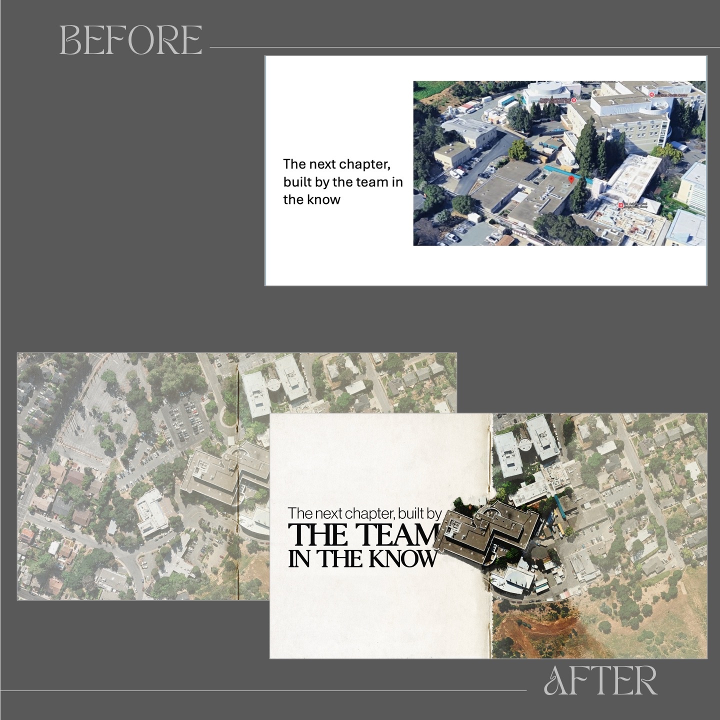
Just like in photography or painting, composition in slide design is key to making content engaging, clear, and memorable. Composition is the spatial relationship between all the elements on a slide. Whether it's text, images, colors, or font choices, the way elements are arranged determines their look, feel, and meaning. Here is a real-world example where composition helped transform a presentation meant to convince a committee of the merits of rebuilding a hospital cafeteria.
The "before" version includes a generic slide with an aerial photograph and a block of text. Minimal thought was given to composition—no clear focal point. The image lacks style and storytelling elements. The overall look is uninspired and feels like a default PowerPoint template.
The "after" version is designed on top of a notebook (see thread stitches in the middle if you enlarge the picture), which matches the idea of continuing a story with the team that's already been on the site and is familiar with the terrain. The slide first shows the entire aerial view in a muted color palette, and then, on click, parts of the image are muted, and just the cafeteria stands out. The font choice balances imagination and precision, evoking both storytelling and architectural planning. Most important: the new composition has meaning because the design choices reinforce the fact that this project is about continuity and improvement rather than just another construction effort.
What are some key takeaways? Don't settle for generic slides; composition should reinforce your message. Choose fonts and image styles that support the story you are telling. And direct attention to key areas by adjusting contrast, size, and placement.