Reduce cognitive load by removing color
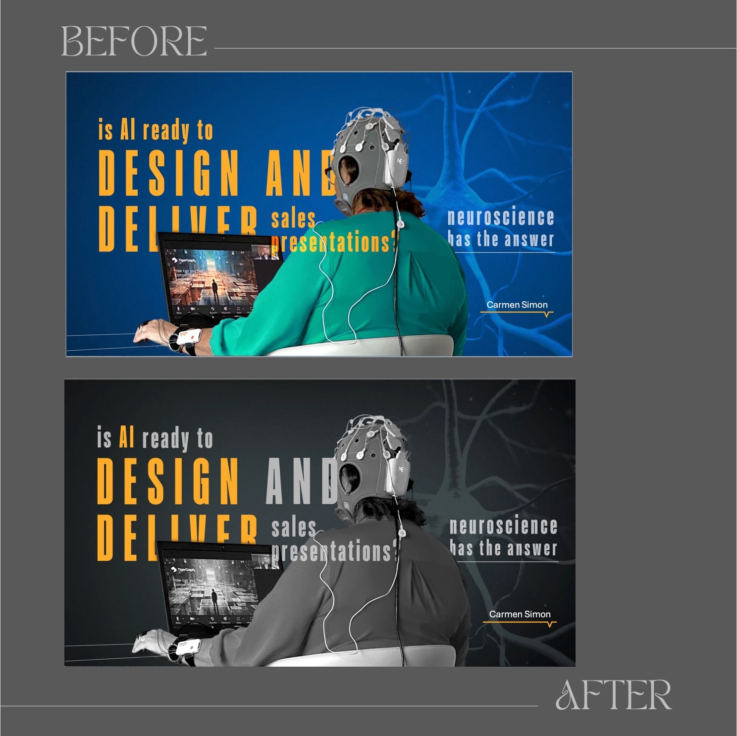
In a recent presentation we created, I was delivering results from a neuroscience study I completed on whether AI is ready to design and deliver sales presentations at the same level as human designers and presenters. The first version of the intro slide included a high-energy color scheme with a bright blue background and bold typography. The composition signaled a scientific theme, but it presented cognitive challenges.
In the revised version, we made a change—selective desaturation. The background and subject turned grayscale while maintaining some of the bold yellow text. The intent was to improve the visual hierarchy by reducing competing elements and drawing sharper attention to the key message.
This technique is based on the figure-ground principle. The brain naturally differentiates between foreground (what is important) and background (what is less relevant). In the first version, the high color contrast forces the brain to process multiple competing elements, increasing cognitive load. In the second version, the brain can process the core message faster because you're removing cognitive noise.
Next time you’re creating a composition with images and text, consider the figure-ground principle. Sometimes, by removing color and visual competition, you can direct attention and improve the clarity of your message.