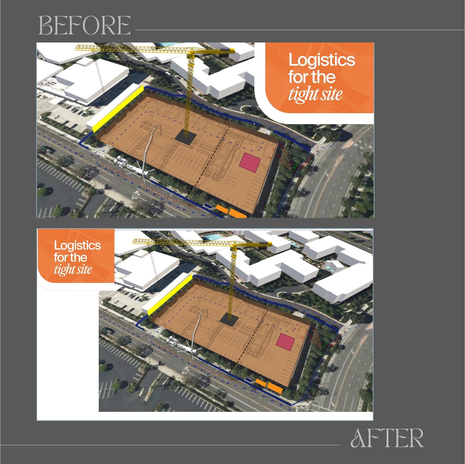
Here is a before and after from a presentation where an engineer was talking about the challenges of completing construction on a tight site, surrounded by other buildings and roads. In version 1, the title of the slide, which is where the eyes should go first, is in the upper right corner but the crane (an important part of the composition) is oriented away from it. The eyes are likely to look in the upper left corner first. So that means the eyes will zig-zag to process the slide.
In version 2, we build off the principle of continuity, which reminds us that the eyes follow the orientation of objects. So, given that the crane is already pointed toward the left, we "meet" the eyes there and place the title in the upper-left corner. The crane is already directing the eyes toward the left, so we “meet” them there by moving the title to the upper-left corner. Now, your visual processing is smoother, more compact, and less effortful.
Next time you’re arranging text and images, use the principle of continuity: eyes tend to follow the orientation of objects—and also the direction of people’s gaze. Align your layout to follow that natural path. This adjustment might take 10 seconds, but it reduces visual friction and keeps your message on track.