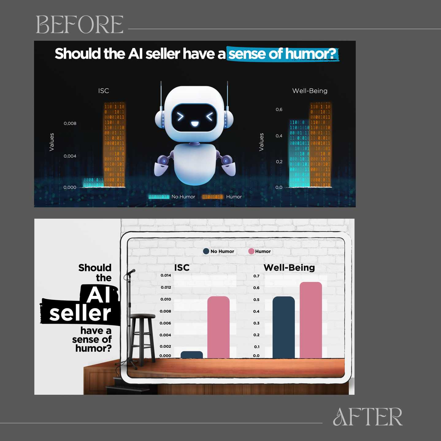
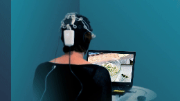
A few days ago, I reported results from a neuroscience study I completed on whether business content should contain humor. These were results from a study where I recorded brain activity while people listened to business presentations—some delivered with humor, some without. I also further sub-divided the groups so that some buyers listened to a human seller using humor and some listened to an AI seller crack a joke occasionally. The results showed that it is beneficial when even serious business content has a touch of humor and even when the seller is an AI, it still helps to lighten the mood.
When I included the findings in PowerPoint slides, especially the charts about AI, one of the designs included a glowing robot and lines of 1s and 0s embedded in bar charts. It was visually on-brand for AI. But something didn’t sit right. Because even though the robot looked friendly and the binary looked smart, the slide was not representative of the study conditions. The AI seller in my case did not have the physical shape of a robot. Buyers talked to a chat bot included on a website. In addition, the slide design did not emphasize the meaning of the main finding, which is “humor helps, even for AI.”
The second version fixes this by placing the findings in a concrete setting that is typically associated with humor: a stand-up comedy club. In the presentation, the charts appeared first on an electronic screen, and then, using an on-click animation, the stage, stool, and microphone appeared for the punchline. This version hit differently—not just because it looked better, but because it felt “truer.”
The reminder here isn’t just about training machines to be funny. It’s about how you design a message. The visuals, the metaphors, the stage you give your ideas. So, as a practical guideline, When you create a design, don’t just match the theme; match the message. Let your design deliver the punchline, not just dress it up.