The problem with designing like an AI
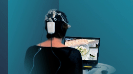
In one of my neuroscience studies, I set out to compare human design with AI design. Before running the brain scans, I conducted a pilot test to validate a simple but important question: Can people actually tell the difference between slides made by a person and those made by AI?
The answer was yes.
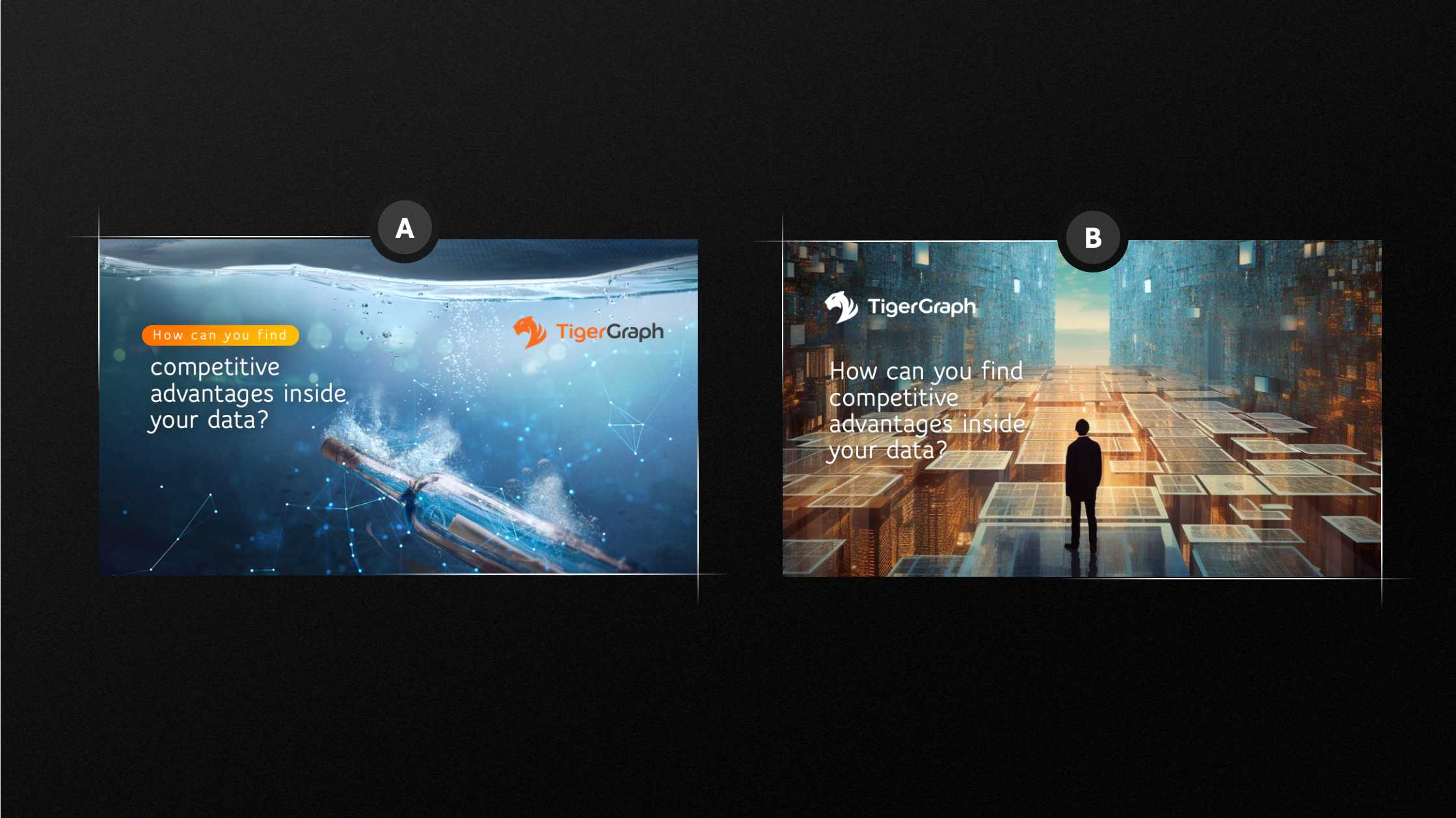
Participants viewed pairs like this one and consistently recognized which slide was human-made. But what makes AI design so instantly recognizable? In the case of the pair below, the prompt for the AI was "Generate a creative and realistic image about finding competitive advantages in big data."
As you can see, in option B, the AI exaggerated the metaphor (as it often does). In this case, it turned the abstract concept of "data" into a massive, cinematic world of floating tiles and glowing corridors. It's visually impressive but leans toward over-symbolizing (a concept called semantic inflation). It's akin to shouting a metaphor instead of whispering it. That intensity can cross into the uncanny or overstimulating territory, which the brain flags as artificial.
The Human design is more respectful of cognitive grounding. Option A uses a bottle underwater, a familiar metaphor (message in a bottle) that evokes curiosity and stays rooted in a concrete world. It hints at mystery and discovery without overloading the viewer. With this option, the brain finds pleasure in resolving moderate uncertainty, not excessive fantasy.
In addition, option B layers too many signals (tiles, grids, corridors, person, horizon), which requires the viewer to decipher too much. Option A uses a single dominant metaphor. Research in coherence theory shows that viewers recall better when visuals don't need extensive metaphor decoding.
Even if you're not a designer, this has implications. If you want to be remembered, resist the urge to pile on symbols. One metaphor, clearly staged, often beats a thousand ideas blurred into one image.