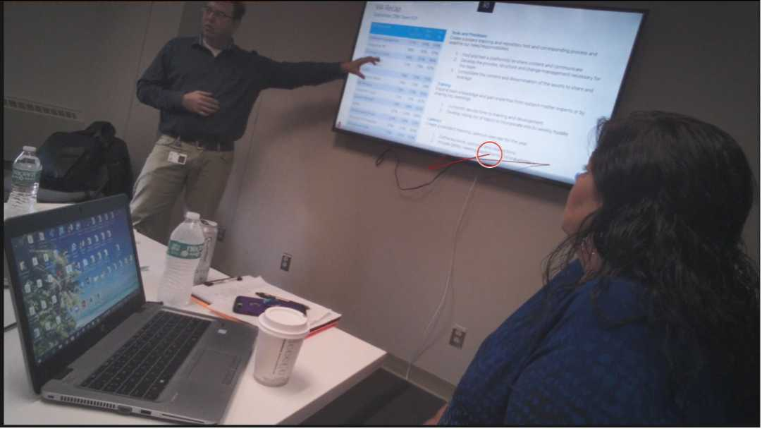
Here is an image from an eye-tracking study that I conducted at a tech company. The presenter wanted to make sure that he shared a presentation with his team that would help them achieve a specific goal by the end of that quarter. His team members agreed to wear eye-tracking glasses, and the leader was courageous enough to see the results (it takes courage to find out whether there is a match between your intent to share something with a group and what the group pays attention to and remembers later). In this image, you can see the presenter's hand pointing to one area but the red circle shows how one of the participants is focusing on another area (and this discrepancy was typical of many text-intensive slides in the rest of the presentation for most of the team). Here are some implications from this eye-tracking map.
The presenter is talking through one part of the slide, while the audience is reading another. This is especially dangerous with text-heavy slides because reading is so automatic. Once text appears, people feel invited to inspect it. In a sense, every sentence on a slide becomes a second speaker. In addition, when a slide has many zones of information, each viewer can have a different experience. The more places people can look, the less likely they are to share the same meaning. And, when everything looks similarly formatted and similarly dense, the audience has no visual reason to privilege one area over another.
So, as potential guidelines, it must share a lot of information, make sure it is ranked well (so people can better tell what's really important when they read), and display elements gradually so they are not tempted to process random information on their own. Because what is important to you is not automatically visible to them.