How to become memorable
Science & Tech • Business • Writing
You will learn guidelines on how to become memorable to your business or personal audiences by using brain science. This is important because people in your life will make decisions in your favor based on what they remember, not on what they forget. To get others to do what you want, they must remember what you want. I am a cognitive neuroscientist and am looking forward to sharing practical results from my neuroscience research that will help you stay on people's minds.
Interested? Want to learn more about the community?

Learn more first
Artificial or human patterns?

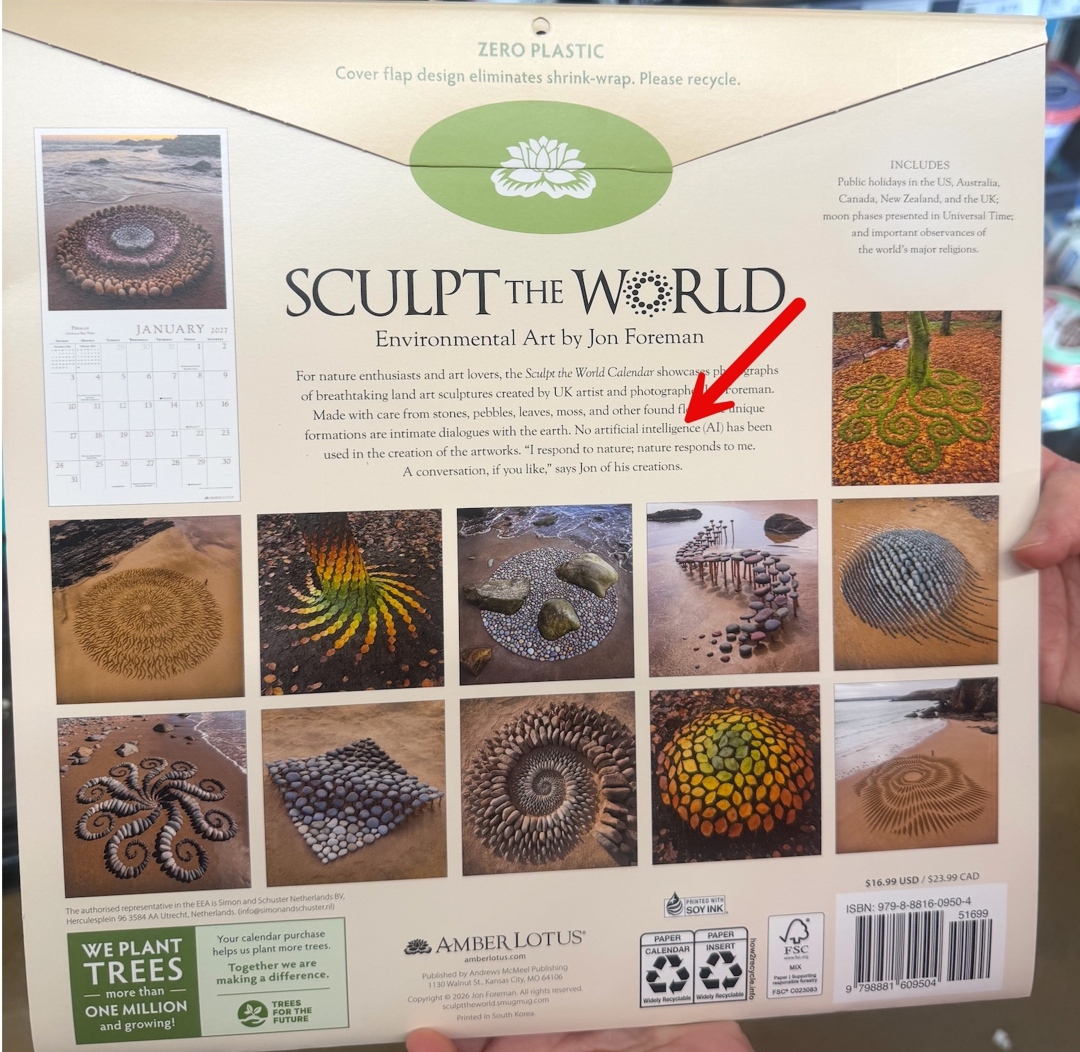
I came across this calendar with environmental art created by Jon Foreman, a highly acclaimed British land artist and photographer based along the Pembrokeshire coastline in Wales. Foreman creates his arrangements out of materials like stones, pebbles, shells, driftwood, sand, and fallen autumn leaves, and he believes in the temporary nature of art. Most of his installations are built on tidal beaches or forest floors, and the tide can wash them away or the wind can scatter them. What intrigued me most about the calendar is the “No AI was used” disclaimer, which appears beside his intricate image and perhaps he felt the need to do this because the shapes look so orderly they seem almost algorithmic.

There is an irony in an acclaimed artist needing an AI disclaimer. AI frequently replicates exactly what some land artists do naturally: it looks at patterns in the world and arranges elements into idealized, hyper-pleasing symmetry. Because AI can generate a flawless spiral of stones in 2 seconds, the only thing that separates Foreman's work from a digital file is the actual, physical reality of it. The disclaimer serves to remind the audience: An actual human stood in the freezing wind on a Welsh beach to place these rocks one by one.

So...how will we (humans) package and sell authentic work in the future? Will the authentic pieces have to carry a “non-AI label,” much like food brands use "Certified Organic" or "Non-GMO" labels? The calendar with the “non-AI” disclaimer is also reminding me that the definition of "perfection" has changed. Now that machines can produce flawless imagery instantly, the value may be moving away from the final image and back to the process required to make it. So perhaps, in the future, in addition to the “non-AI label,” it will also be important to show an audience not just the final product, but also how you arrived at that product. In his case, Foreman would have to attach to the calendar additional images or thoughts on how he responded to the tide, the shore, and the stones available, which would tell us what the artist was actually doing?


post photo preview
Interested? Want to learn more about the community?

Learn more first
What else you may like…
Videos
Posts
Articles
When memorable does not mean usable

In a research project, I asked sellers whether bold slides are more memorable. Most agreed. Then I gave them a choice between two slide designs, one with a surprising metaphor (which they agreed was bold and memorable) and one that you see displayed here. The video includes one of the sellers' commentaries, justifying why he would use this bland design you see, and not the bold one. I find this humbling because a design can be deemed memorable and still not make it into the final presentation. Sometimes designers try to impress with unusual metaphors and Photoshop tricks, and those slides, while deemed memorable, do not get used. So, as a content creator, it's useful to ask: is this slide memorable and also will it be used? Something can only be memorable if it makes it into the room....

00:00:55
September 16, 2026
AI design vs. human design

I am often asked whether AI design has merit compared to human design. In the neuroscience studies I conduct on the subject, I notice that, on the surface, when I ask participants, "Do you think audiences will appreciate AI design?" and "Are you likely to use AI design?", the answers are yes, as long as "the design is decent." The definition of decent design is up for debate but when I test buyers' and sellers' responses to AI design vs. human design implicitly, without asking them questions related to their attention, cognitive workload, mind wandering, Eureka effects, and motivation to keep going, I notice that while the explicit brain says yes, the implicit reaction (and more genuine one) is no. People mind-wander more as they process AI design; the Eureka effect is not as strong (even when the script is held constant across conditions), and memory is therefore faulty. So, be very cautious, at least for now, about using too much AI in your design for commercial purposes.

00:00:20
The biology of delegation

I am currently conducting a neuroscience study to capture how the brain interacts with AI tools. Participants complete several simulations where they are either the seller or the buyer in a commercial conversation. The study is global and assumes participants speak English while interacting with an AI avatar. This person in Tokyo was super smart and eager to contribute but did not speak English. However, he had a great idea: we trained his AI agent to talk to the AI buyer. I felt like I was witnessing the new era of the future of work, watching an AI seller talk to an AI buyer as the human stays in the loop. A good lesson for all of us: agency does not always look like doing everything yourself. Sometimes it looks like recognizing your limits and finding the right support and a way to accomplish something despite a constraint. In the future, the ability to orchestrate tools may become part of how we are evaluated by others.

00:00:37
What happens after they look?

I was browsing through an art book, and I came across this image showcasing a giant duck. I found out that the duck is part of a series of extra-large floating sculptures created by Dutch artist Florentijn Hofman. This particular one was photographed in Onomichi, Japan, during a maritime festival. You can imagine the visitors’ surprise when they saw an object you typically associate with something much larger, but much, much, much, much smaller. The project apparently began in 2007, and the duck appeared in waterways around the world, like Amsterdam, Sydney, Sao Paolo, and Hong Kong. Two practical guidelines occurred to me as I looked into this artist’s work.

Because I strongly believe in the notion of a “10% message” (meaning controlling what others remember from one’s body of work), it’s useful to consider a message that “travels,” keeping its essence regardless of who receives it or where it is received. The giant duck ignited similar reactions in all these corners ...

post photo preview
The backgroud is speaking

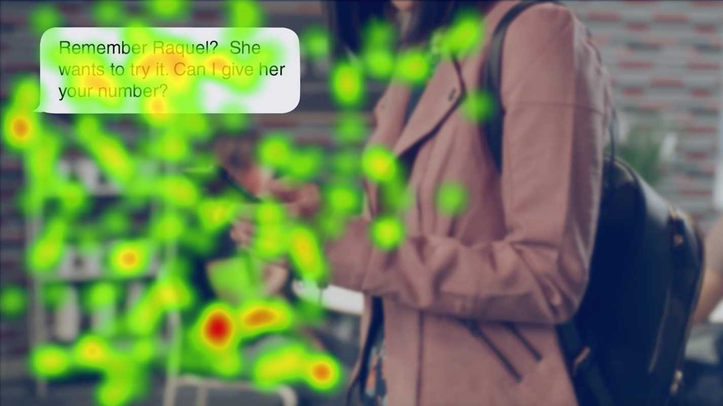
Here is a screenshot from a corporate video that a client of ours created for a sales team to motivate them to sell a retail product. This scene shows a text message exchange in which one person tells another that a prospect is interested in trying the product. In the neuroscience research I completed to study the video's impact on the seller’s brain, I noted how much attention is directed to the background. It is possible that viewers might be using the person, phone, or setting to decide whether the message feels believable. People look at the words but still spend attention figuring out the scene around them. The practical guideline for any communication designer is to consider that the background may be carrying part of the story, and every visible detail could suggest something about the situation. If those details do not contribute to the message, then remove then reduce the segments that might start competing stories.

post photo preview
Can monotony make us better?

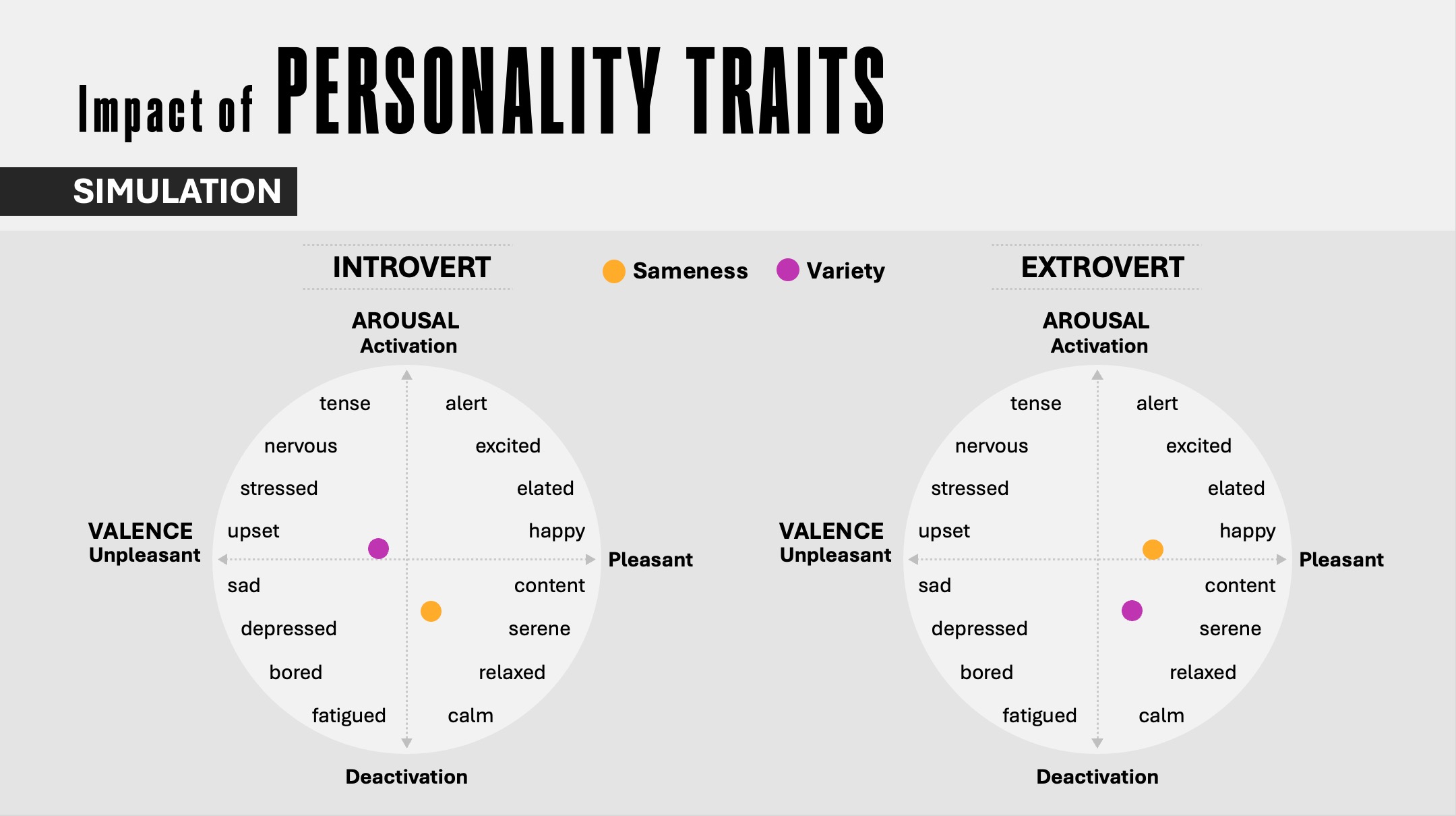
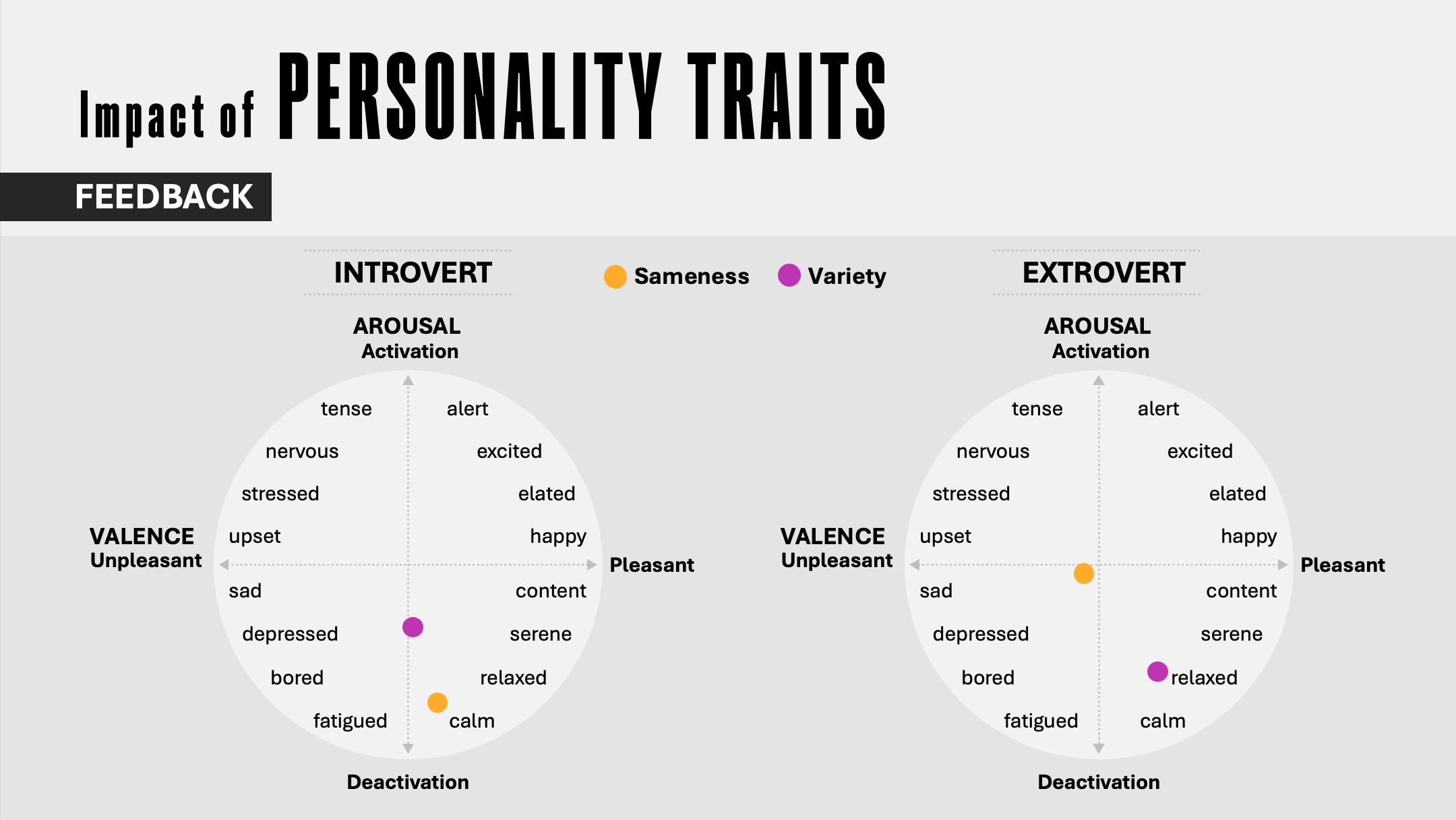
Here are two charts from a global neuroscience study I completed, where I was looking to see what happens in the brain and body when people learn a skill in two ways: repeating a task again and again (Sameness group), or adding some variety to protect against boredom (Variety group), and also to observe some demographic differences. Essentially, the research question was: does monotony have any learning advantages? During the study, participants completed a role-play (either in the sameness condition or the variety condition), and then they received feedback on how well they performed. The first chart displays the aggregate signal (EEG and ECG) parsed by personality type (introvert vs. extrovert), showing affective variables, meaning how much people enjoyed the experience and how alert and awake they were during that experience. The second chart shows the same results except for how people processed the feedback they received after completing the task. Participants used AI to learn and ...

The storyboard advantage
From ideas to engagement

When creating a presentation, it's tempting to think of it as a finished product—a sequence of static images combined with text locked in place. But the most effective presentations are not just static layouts; they're experiences that unfold. Here is an example from a presentation where we wanted to demonstrate the importance of creating an immersive experience in architecture/construction. 

Only for Supporters
To read the rest of this article and access other paid content, you must be a supporter
Read full Article
From generic to genuine
Reducing cognitive friction in business presentations

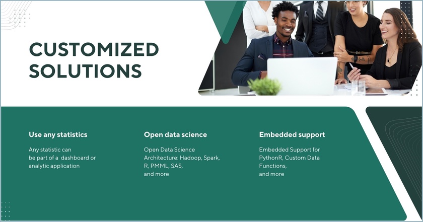
I am noticing that businesses often promise their customers personalized services as a means of differentiation. We offer “tailored solutions,” “customized experiences,” or we “focus on what matters most to you”…. they typically say. Yet, these promises are packaged in standardized presentations filled with generic stock photos. You must have seen slides like the one below many times: Images of generic meetings, people at laptops, or happy people looking at phones. Despite the claim of a “tailored approach,” the content feels like it could belong to any brand.

This conflict between the promise of personalization and templatized design creates cognitive friction for the viewer, who unconsciously senses a disconnect between the message of uniqueness and the impersonal images they’re seeing. Cognitive friction occurs when an audience encounters content that feels out of sync with the promised message. The brain, always searching for coherence, struggles to reconcile this gap, making the message less memorable and even eroding trust.

There are several ways to fix this, but here are three. Use images and compositions that help your audience envision:

  1. The experience they will have while working with you
  2. The process they will complete to achieve business results and/or
  3. Outcomes they are seeking

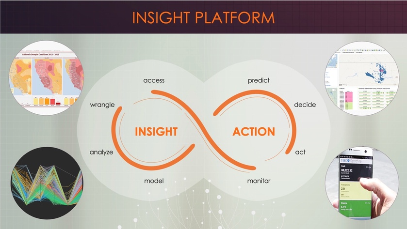
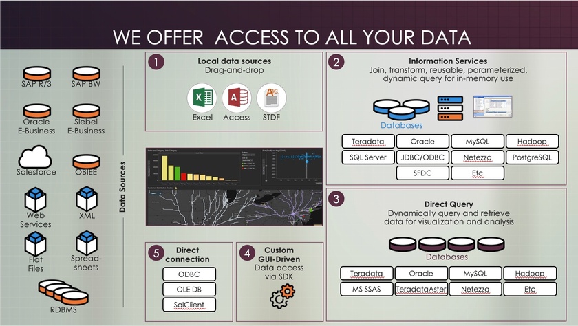
The following slides are from a sales presentation we designed for a platform used in predictive and prescriptive analytics. Each slide exemplifies one of the guidelines above.

Visualizing experiences

Using this slide, the vendor visualizes a proposed journey and explains to his customers how they can oscillate between action and insight by using various software capabilities. The screenshots are from the real application; they are not stock photos.


Visualizing process

These segments are displayed gradually (note how some are numbered) to explain how the process of working with the vendor and the software will unfold. This step-by-step breakdown gives a concrete sense of how collaboration happens in real life.


Visualizing outcomes

This slide is presented multiple times to remind customers why this vendor’s solution is useful. Displaying expected results reinforces the value that a solution can bring.

Throughout these examples, notice the absence of overly staged smiles and generic stock photos—the kind that make presentations feel interchangeable, standard, and impersonal.

By anchoring your message in authentic experiences, clear processes, and real outcomes, you’re aligning your content with the brain’s natural drive for coherence. This approach reduces cognitive friction and reinforces the trust you’ve promised through personalization. The result? A presentation that feels unique, credible, and memorable—one that embodies the tailored experience you’ve promised.

Read full Article
Tea, trust, and thinking
Using slow moments to connect with an audience

In one of my neuroscience studies, I decided to compare the brain's response to a business video meant to intrigue buyers with an app versus... well, a video of tea brewing. As you can see below, nothing but tea leaves slowly steeping. I thought, 'This is going to be the ultimate snooze test.' But to my surprise, people weren’t bored! On the contrary, they enjoyed the moment and remembered it later. I suspect one of the reasons is because of a process called reflexive thinking.

Reflexive thinking is a kind of mental space where, when there isn’t much happening on screen, our brains start filling in the blanks. We reflect on our own thoughts, make connections, or dig into personal insights. This state doesn’t just hold attention—it encourages better memory and even creativity.

Of course, the surprising results might also be due to anticipation. Even with slow visuals, the brain stays alert, waiting for the unexpected. Maybe something surprising will emerge from the cup? This quiet anticipation keeps viewers engaged on a subtle level, almost as if they’re playing a mental game with the content.

The brain thrives on the unseen edges of a moment, where thought meets possibility.

So, how can you use this in your own content, even if you’re not a designer?

  • Use gentle transitions: Instead of sharp cuts or rapid slides, try slow fades. They subtly signal the brain to slow down, encouraging a deeper mental pause.
  • Create a few minimalist moments: Include a slide with just one word or a blank pause with a simple background. This "mental whitespace" gives viewers time to digest what came before, making it effective even in tech-heavy presentations (as long as it's kept to a minimum).
  • Slow down the summary: Consider using a reflective tone to signal a shift from information delivery to introspection. This change in pace cues your audience that it’s time to absorb and reflect on what they’ve learned, reinforcing their memory of the content as they mentally summarize it themselves.

Sometimes, the mind finds depth not in speed but in the silent pull of what might come next.

Read full Article
Available on mobile and TV devices
google store google store app store app store
google store google store app tv store app tv store amazon store amazon store roku store roku store
Powered by Locals